
Every
Last Spot
Brand & Web Designer
A deep cleaning service with a steady list of paying clients, but no brand and no website to grow past word of mouth. I built both, from the logo to the live site.
Where I Started
A good business that looked
like it didn't exist
Every Last Spot already had paying clients and a service that worked. What it didn't have was a logo, a brand, or a website. To a new letting agent searching for a cleaner, it looked like it wasn't there at all.
The job wasn't proving the service. It was making it look as solid as it already was.
They needed something usable straight away, so I put together placeholder branding quickly, then built the proper thing behind it.
And before any of that, I wanted to understand why a letting agent actually pays for a deep clean. Get that right and every line of copy has something real to say.
01 · The Brief
Clear service,
clear constraints
The client came with a specific ask: a brand in black and orange, a logo that features a building and reads as a cleaning company at a glance, all under the name Every Last Spot.
Good constraints to design within. Behind them sat three things to get right.
Real customers, no presence
An established service with nothing to show for it online. Weak first impressions were quietly costing them growth.
A brief to hit
Black and orange, a building in the mark, and an instant read of "cleaning". Tight rules to work cleanly within.
Speak the agent's language
The site had to talk to letting agents in their terms, which meant understanding why they book a clean in the first place.
02 · The Work
How I got from
brief to brand
Understand why anyone pays to clean
What I did
I started with three plain questions: who are the customers, what problem do they have, and how do they solve it now? The answer: letting agents, who need a property spotless once tenants move out, and who either handle it in-house or hire it out.
Then I mapped the why behind it. That session turned up five clear reasons an agent books a professional deep clean, and those reasons shaped the copy later.
Know exactly why someone buys and the website almost writes itself. Skip this and you're guessing at every headline.
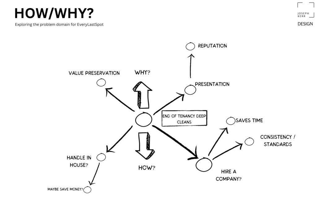
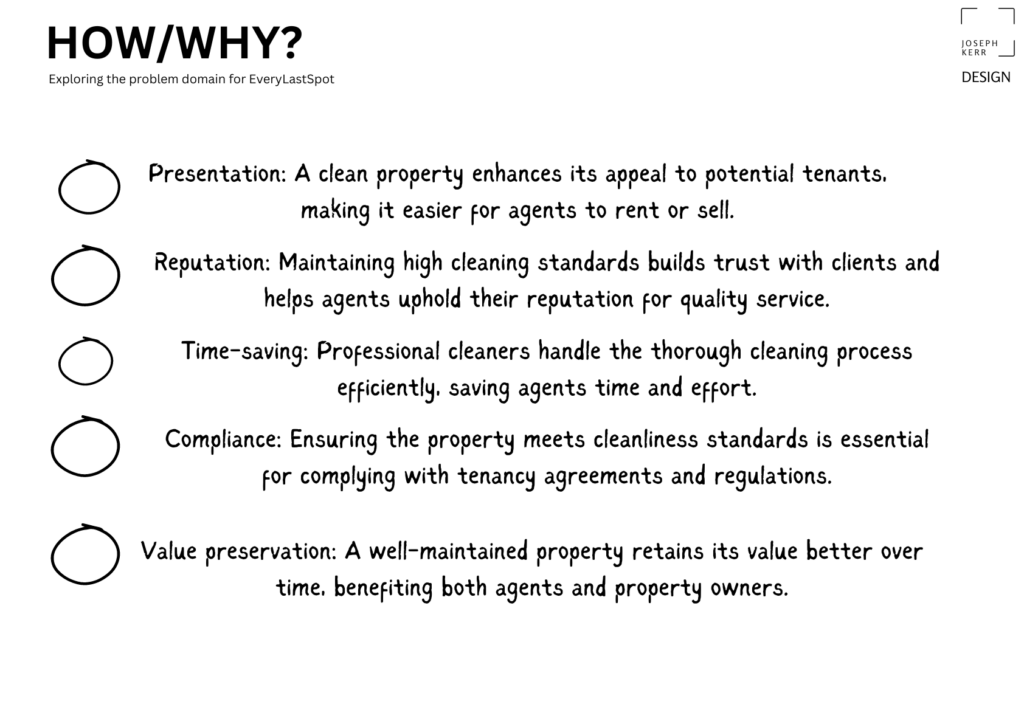
Mapping the how and why behind an end-of-tenancy clean. Click to view full size.
Design for real people
What I did
I built three personas with the client's input: Emily, Oliver and Patricia. Different roles, different pressures, all circling the same need for a reliable clean.
They kept the whole thing honest. When a choice was close, I asked which of them it served, and the answer settled it.
A busy agent and a cautious landlord don't want the same reassurance. Naming them shaped what each one sees first.
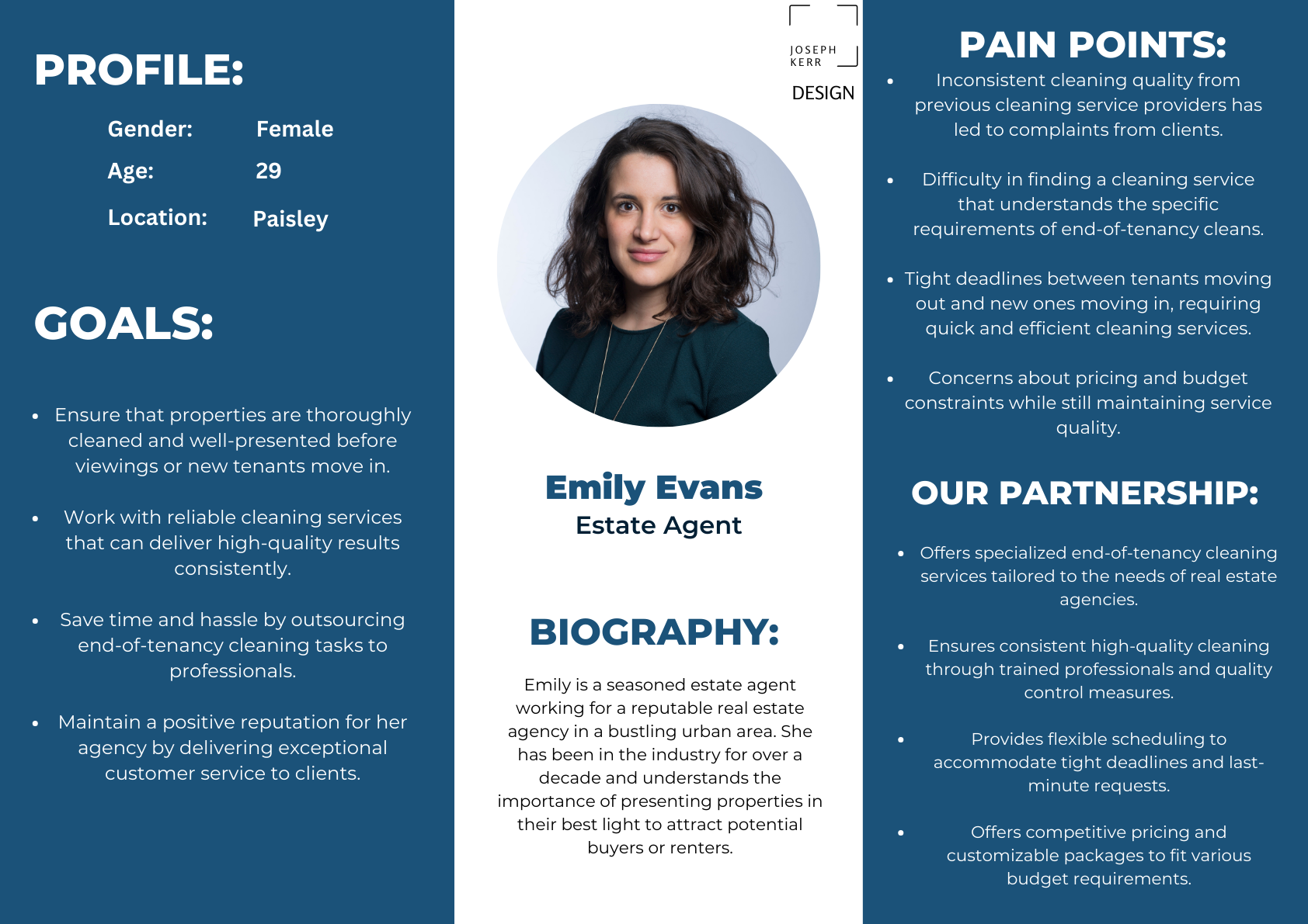
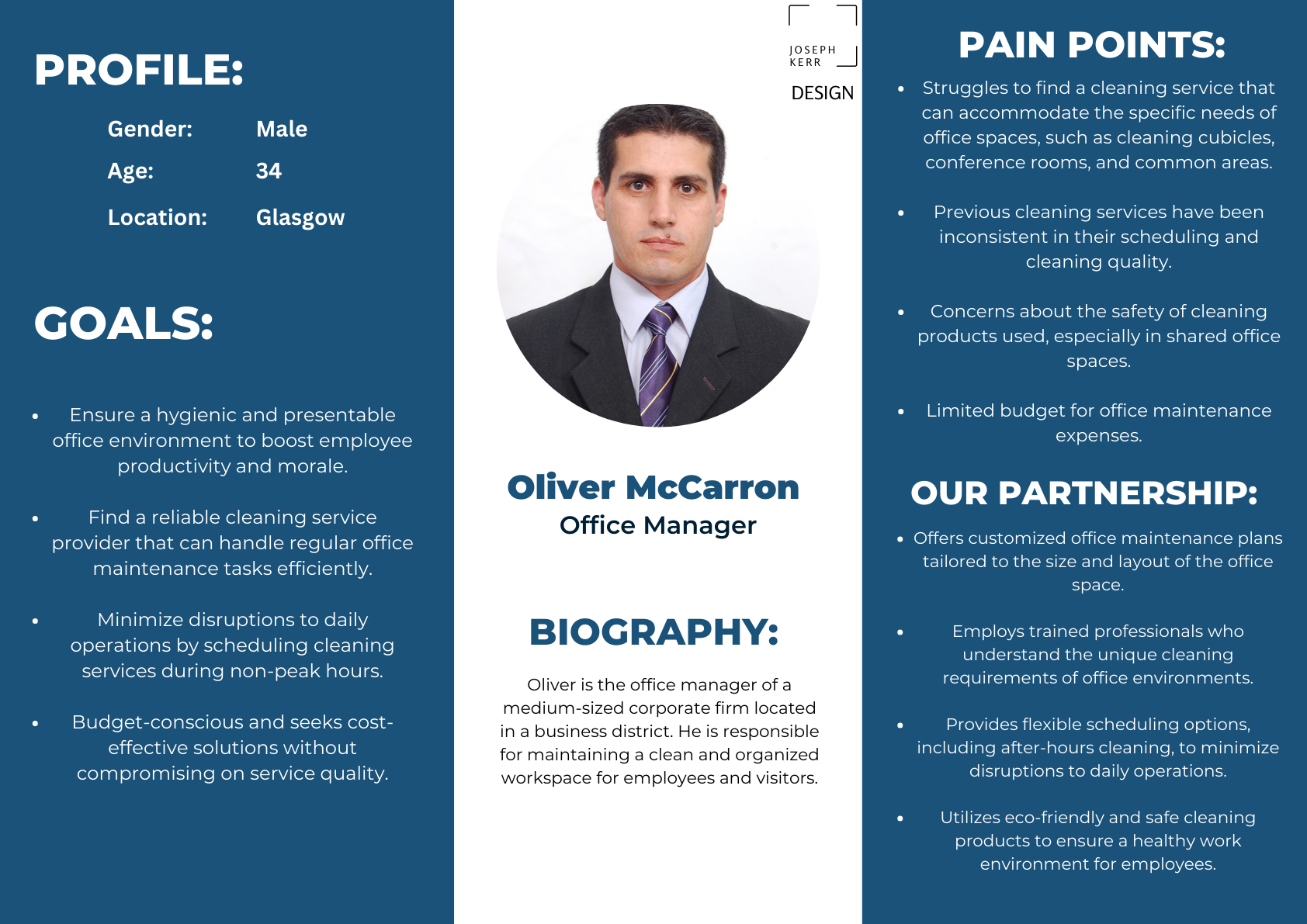
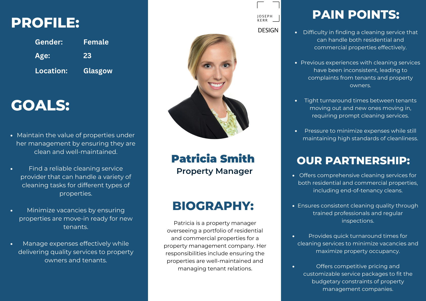
Emily, Oliver and Patricia. Click to view full size.
A logo that hits every part of the brief
What I did
The mark had a checklist to meet: a building, a clear cleaning cue, and black and orange only. I drew a house with a broom sweeping across it, a scatter of sparkle, and an orange sweep underneath.
Building, tick. Reads as cleaning, tick. Black and orange, tick. And it holds up in one colour on a light or dark background, which matters once it's on a van or a form.
A tight brief is a gift. Every constraint was one less decision to second-guess later.


The mark on light and dark: a home, a broom and a bit of sparkle
The Plan On One Page
The whole business,
mapped in one view
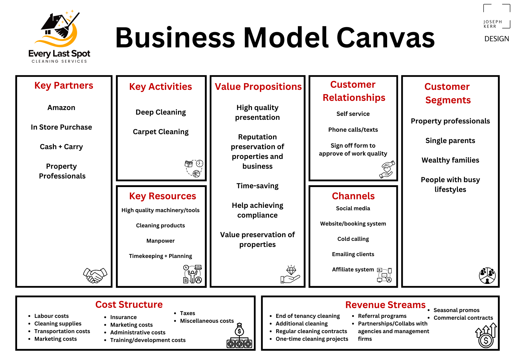
Alongside the personas, I laid the business out on a business model canvas: who it serves, what it offers, and how the work actually makes money.
It gave me the full picture of the field before I designed a single screen, so nothing on the site was there by accident.
Customers, offer and revenue, all in one frame.
03 · Why It Works
The site says what
agents actually care about
This is where the how and why work paid off. A letting agent doesn't book a deep clean on a whim, they do it for real reasons. I mapped five, and the copy speaks to each one.
A clean property is easier to rent or sell.
High standards build trust with their own clients.
Pros do the graft, agents get their time back.
It meets the standard tenancy agreements demand.
A cared-for property holds its value over time.
Understand why they buy, and every line of copy has something real to say.
04 · The Design
Dark, bold, and
quick to trust
For a service like this I like a big background image, a little microcopy, and one clear next step. So the homepage opens on an empty property, the name in orange, and two buttons: see what they offer, or ask for a quote.
Scroll down and there's a bit more to lean on: a short standard-bearer line, what they offer, and a quote form. Even basic supplementary info like this helps a stranger trust you enough to get in touch. I prototyped the lot in Figma first, then built it in WordPress, which makes it easy to chop and change the bigger elements later.
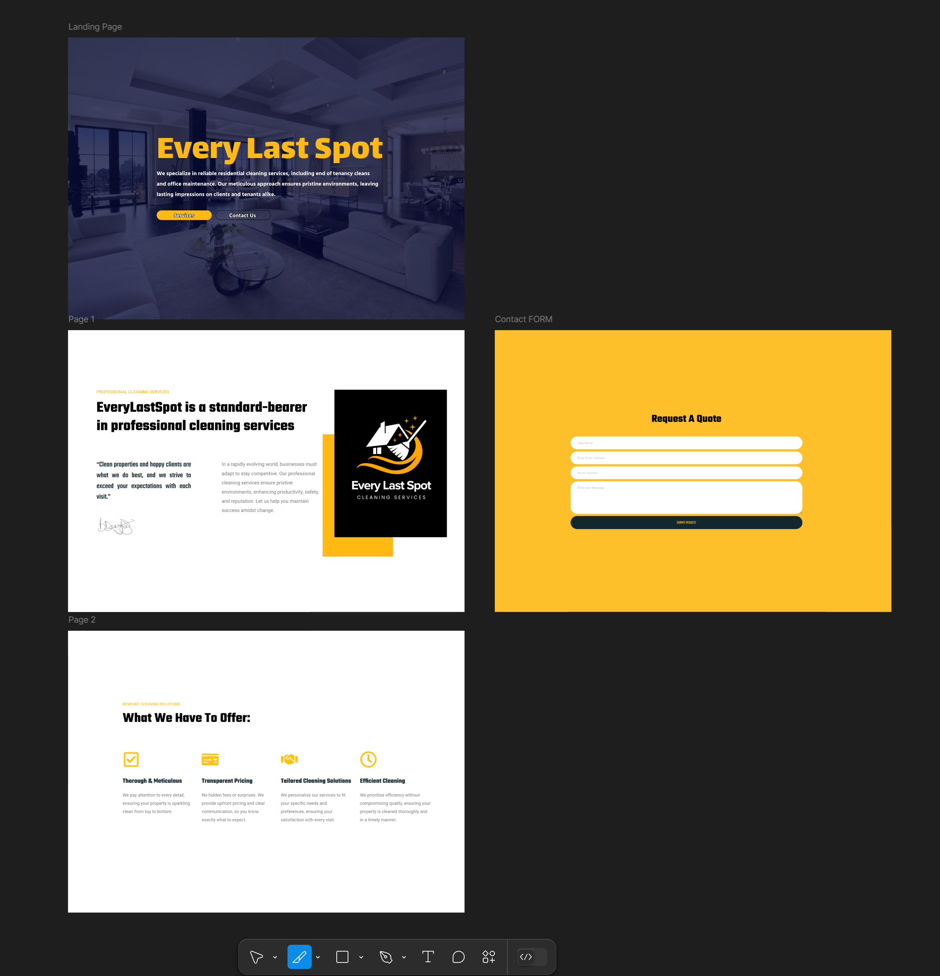
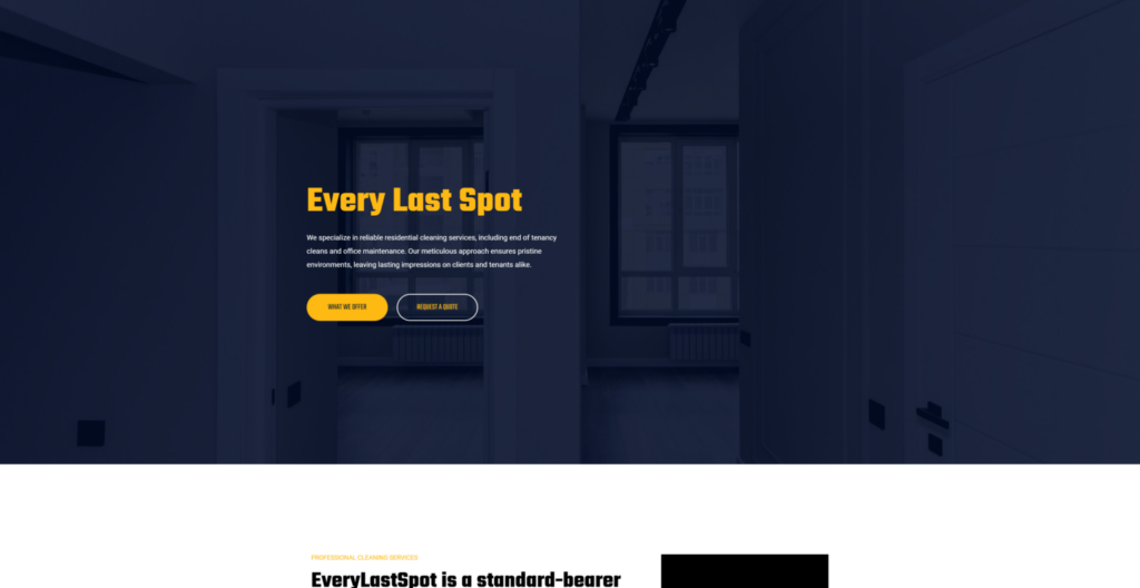
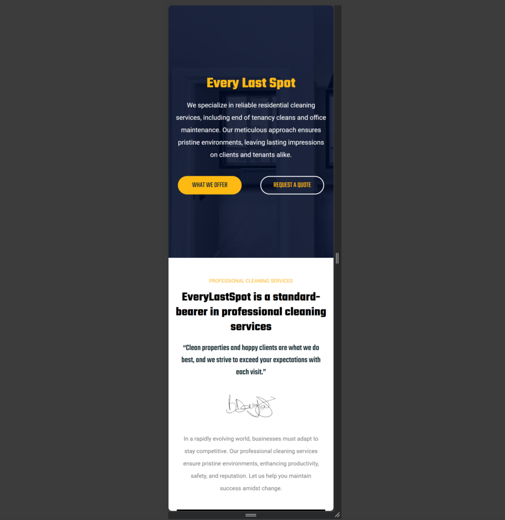
The prototype used no bought stock, since a better photo always turns up for the final release. The black and orange runs through the lot.
05 · The Outcome
Live, and ready
to grow into
The client signed off the simple one-page site, we ironed out a handful of minor setbacks early on, and tuned the responsive layout until it held up across screens.
Testing flagged three things worth adding before launch: a privacy guarantee to put people at ease, a note on the service area, and clear form instructions asking for property size and preferred date. It went live at everylastspot.com: a proper brand and a site an established business can finally grow into.
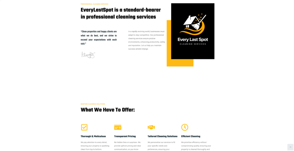
The finished site: brand, offer and quote form in one place
Every Last Spot. Brand & Web Designer, Joseph Kerr.