
The Tiny
Truck Guys
Brand & Web Designer
A Yukon crew imports Japanese kei trucks and kits them out for real winters. They needed a brand and a website that could explain an unfamiliar little truck, and sell it, in one month.
Where I Started
You can't sell what
nobody's heard of
Kei trucks are brilliant: tiny, tough Japanese pickups that go where big trucks can't, for a fraction of the price. The catch is that most people in the Yukon have never seen one, let alone thought about renting one.
That price gap is the whole pitch. Yukon winters are brutal, months of deep snow and stretches well past minus 40, and they leave plenty of ordinary vehicles stuck. A kei truck lands well under the cost of a full-size pickup or a purpose-built snow machine, sips fuel next to either, and you can swap the tyres for snow tracks so it takes all of that on without the deep-winter price tag. The site had to make that case plainly.
The site's first job wasn't selling. It was teaching.
So before any of the good-looking stuff, the plan had to answer three questions fast: what is this thing, why would I want one, and should I rent or buy?
And it all had to ship in a month, live before the client's first truck even arrived, which changes how you build.
01 · The Brief
A new product,
and a tight clock
The Tiny Truck Guys import, refurbish, rent and customise kei trucks: snow tracks, plough kits, utility racks, whatever a Yukon winter throws at them. Good product, real gap in the market.
Behind the brief were three problems worth naming up front.
An unfamiliar product
Most customers had never heard of a kei truck. The site had to explain the idea before it could sell it.
Rent or buy?
A weekend adventurer, a local trade and a remote resident all want different things. The site had to make that choice easy.
One month, few photos
A tight deadline and a truck nobody had good pictures of. Building the whole thing from scratch was off the table.
02 · The Work
How I got from
brief to brand
Work out who's actually buying
What I did
I built personas for the core audiences: weekend adventurers, local trades, people who want a truck customised, and remote residents who need something that always starts.
Four very different reasons to want the same little truck. Naming them early meant every page could speak to a real person instead of a vague crowd.
The adventurer and the tradesperson don't read the same way. Knowing that shaped what each of them sees first.
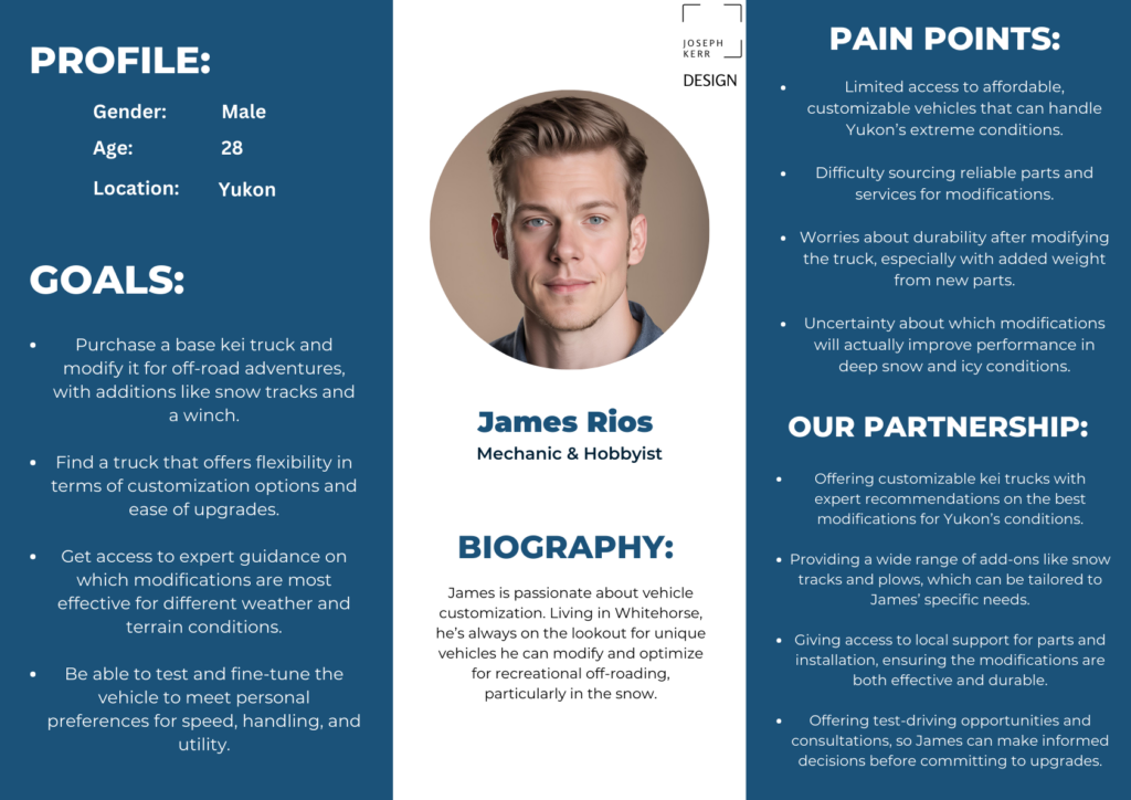
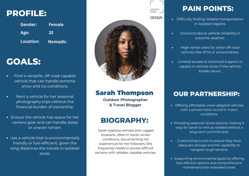
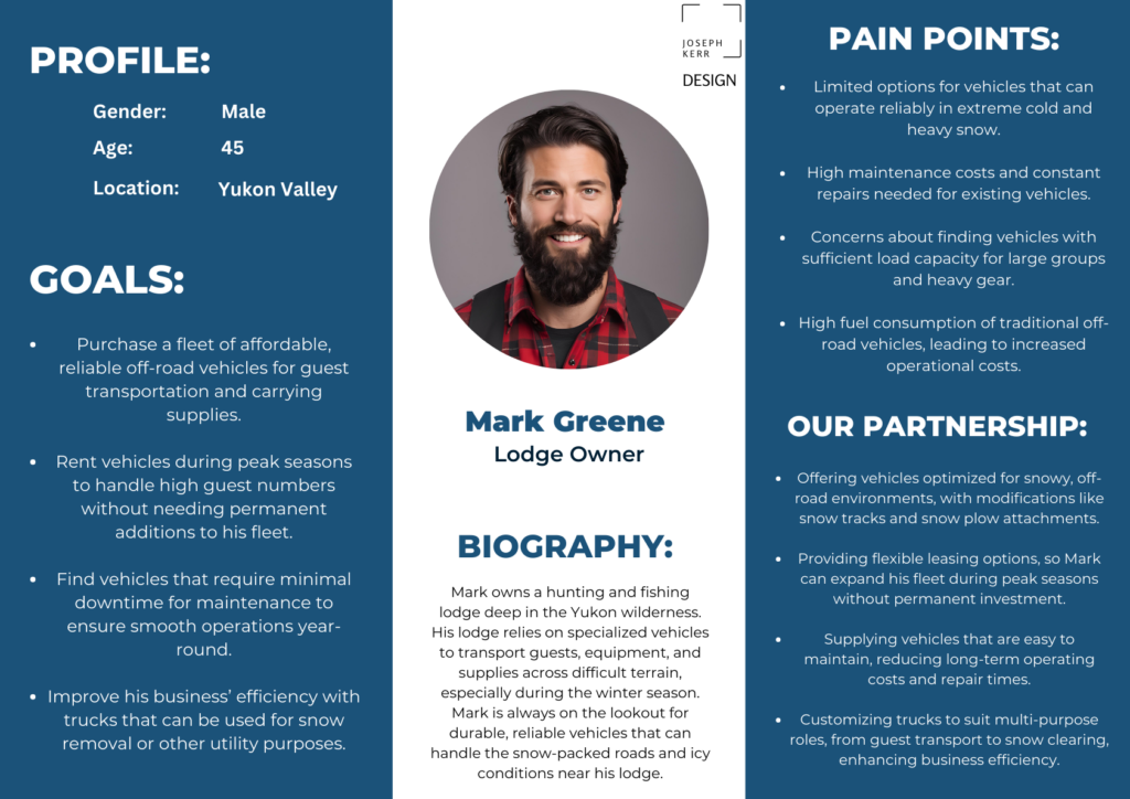
Personas for the core audiences. Click to view full size.
A badge that says rugged, and Yukon
What I did
The logo had to feel tough and local at a glance. I built a badge: the Yukon mountain range, the client's own kei truck drawing, and a bold industrial name underneath.
The client's truck art was detailed and the mountains were busy. The real work was subtraction, stripping both back until the badge read clearly at any size.
A badge lives or dies at small sizes. If it doesn't hold up as a favicon, it isn't finished.
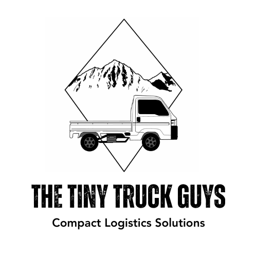
The badge: Yukon range, kei truck and a bold industrial name
Sketch fast, borrow smart
What I did
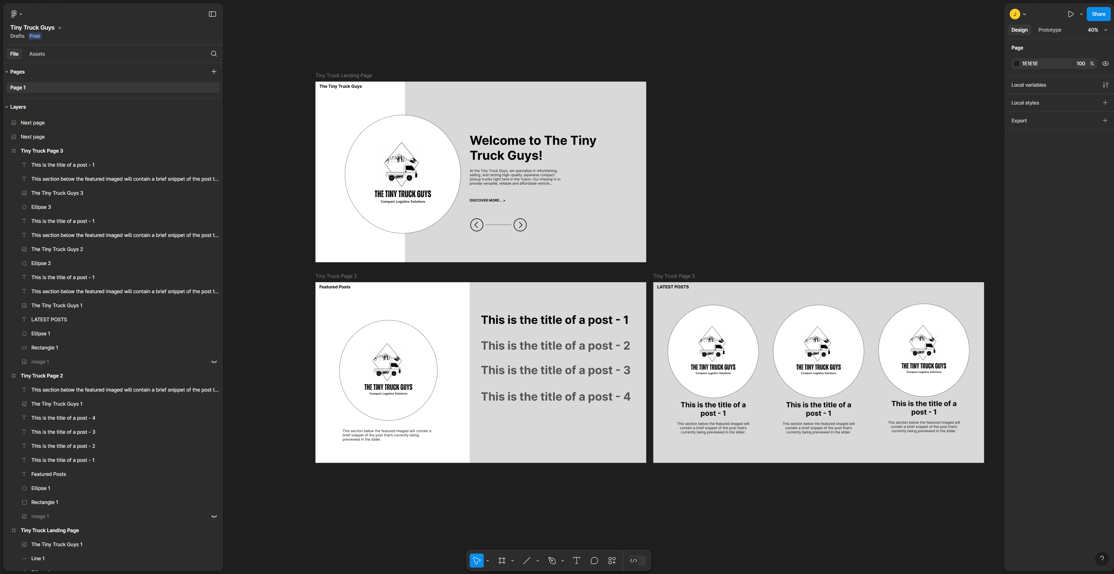
The client wanted Ghost, running on his own domain. It's lightweight and quick, but it asks for real CSS work to customise, and a month leaves no room for that. So I sketched the layouts by hand and built on an existing Ghost template, borrowing a solid structure instead of reinventing the wheel on a deadline.
That freed the time up for the part that mattered: the story of the truck, and showing it off properly.
A month is not long. Starting from a proven layout put every spare hour into content, not scaffolding.
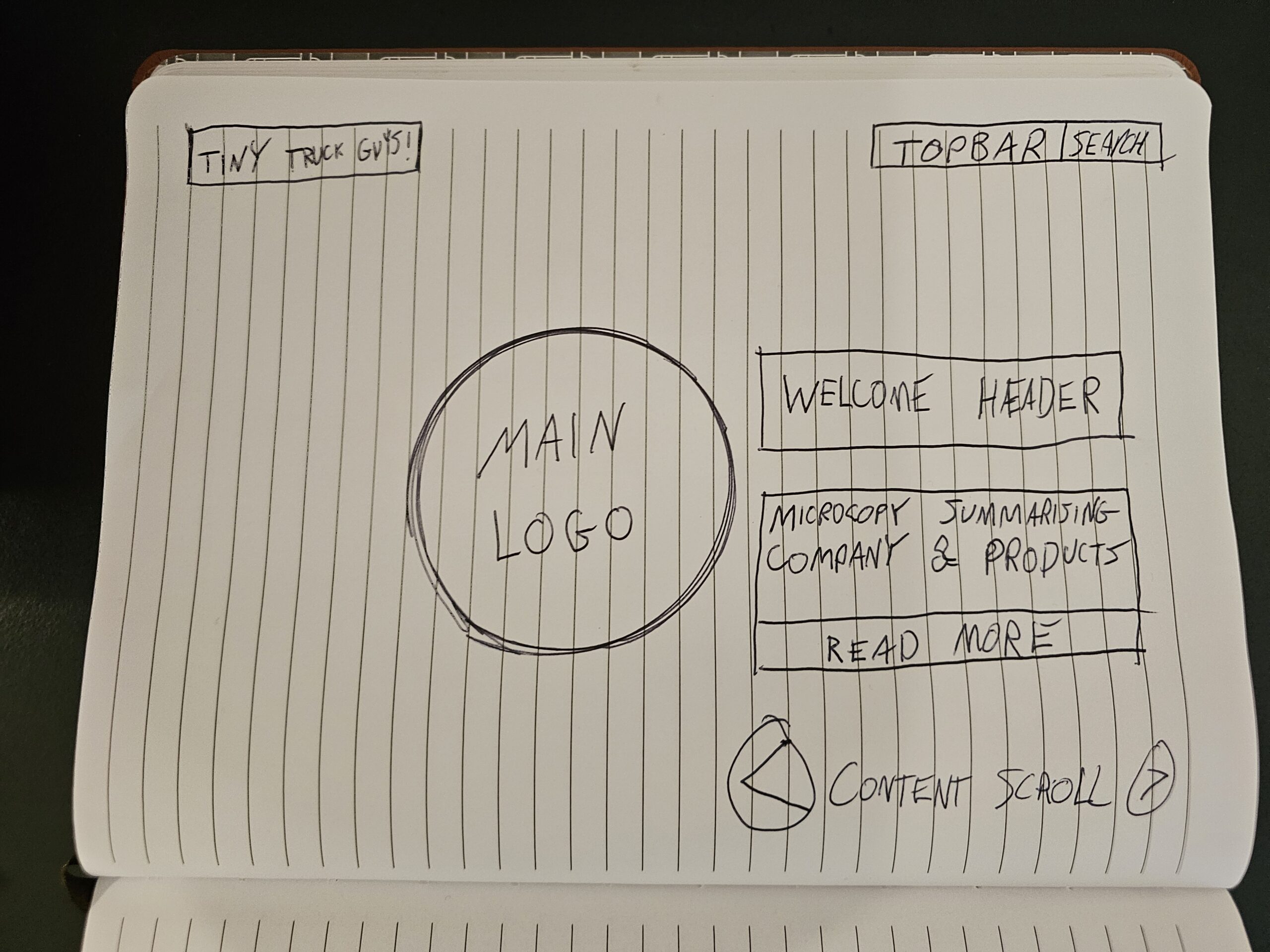
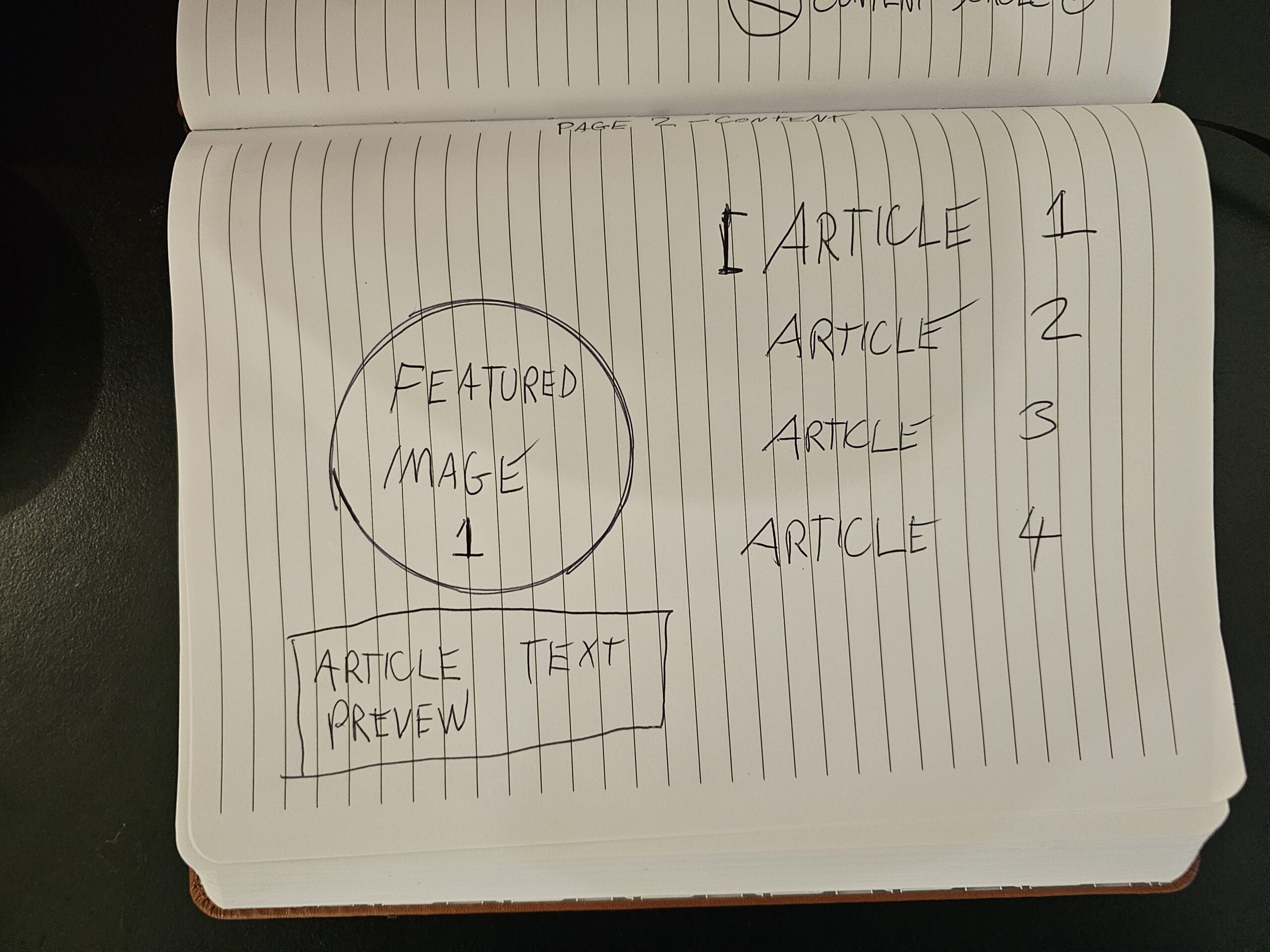
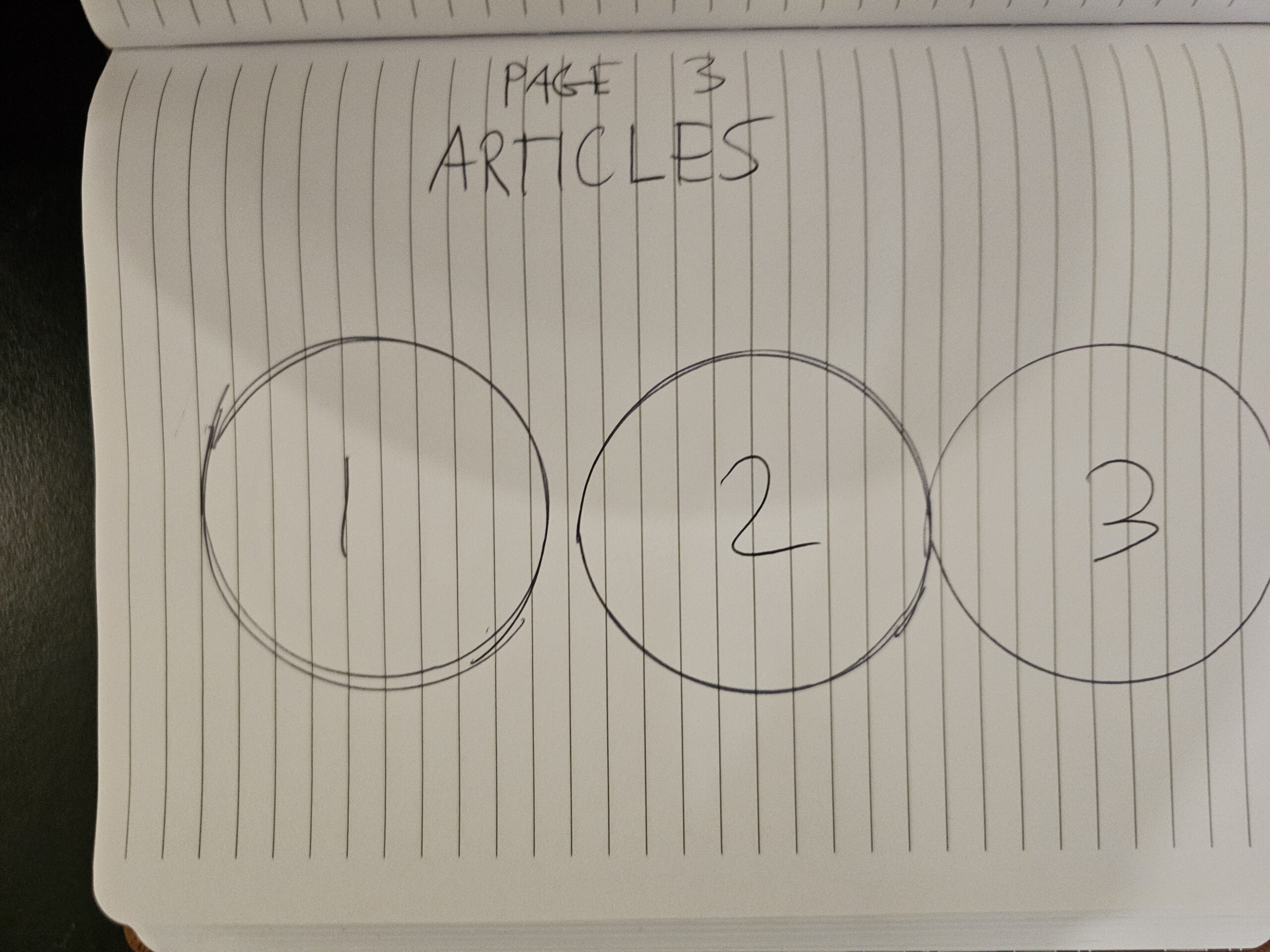
Layouts sketched by hand over an existing Ghost structure. Click to view full size.
The Plan On One Page
The whole business,
mapped in one view
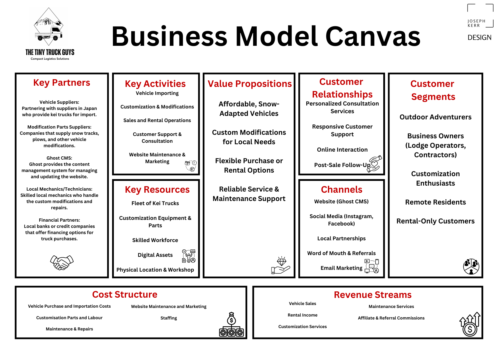
Before building, I laid the business out on a business model canvas: who it's for, what it offers each audience, and how renting and selling both earn their keep.
It kept the design honest. If a page didn't serve something on this canvas, it didn't make the cut, which matters more than ever on a one-month build.
It earned its keep off the page too. For the client, the canvas became a private planning tool, a way to weigh up his cost structure and work out which revenue streams were worth backing before a penny went in.
Audience, offer and revenue, all in one frame.
03 · Why It Works
It teaches first,
then it sells
The finished site walks a stranger from "what is that little truck?" to "which one do I rent?" without a hard sell. The groundwork made that possible on a tight clock: real personas, a clear plan, and a proven layout to build on.
An unfamiliar truck + a clear explanation = a customer ready to ask.
04 · The Design
Rugged, clean,
and quick to read
The look leans into the brand: bold industrial type, plenty of white space, and the badge doing the heavy lifting. Big honest headlines, then straight to the trucks. It reads the way the business talks, no fuss, no filler.
Good photos of kei trucks are hard to find, so I made them. The vehicle imagery is generated to order, and I used AI for a first pass of the microcopy, then tightened every line by hand.
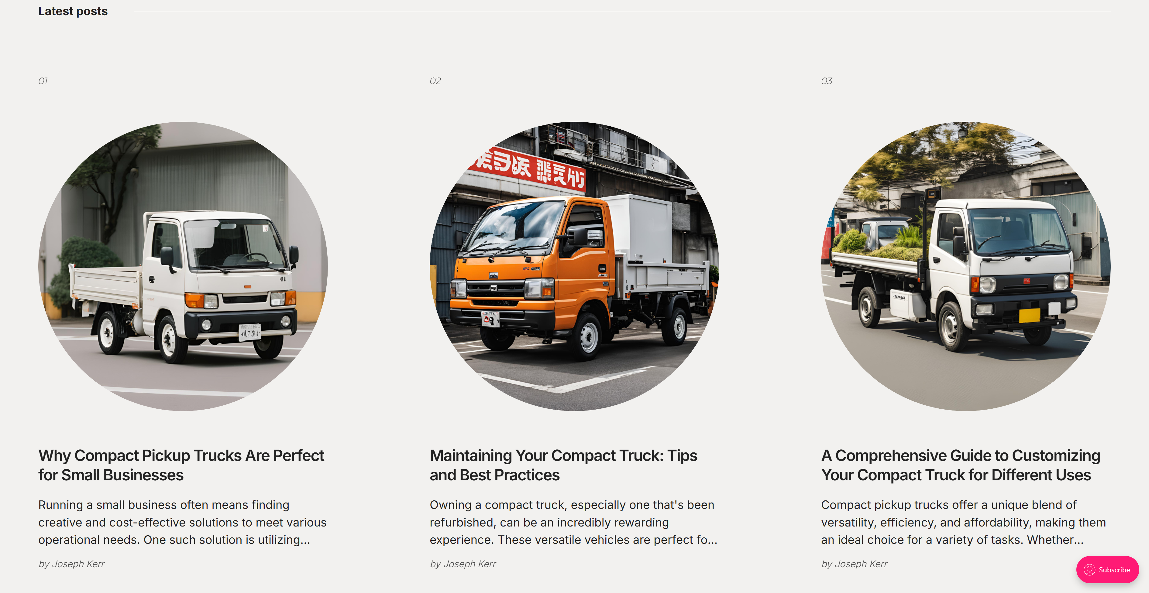
The same system runs across the About page, the article template and every listing, so the site stays quick even with the image-heavy galleries.
05 · The Outcome
Live inside
the month
I prototyped the full site in Figma, then built it in Ghost. AI filled the gaps a brand-new business couldn't: custom truck imagery where no stock existed, and a first draft of copy I sharpened by hand.
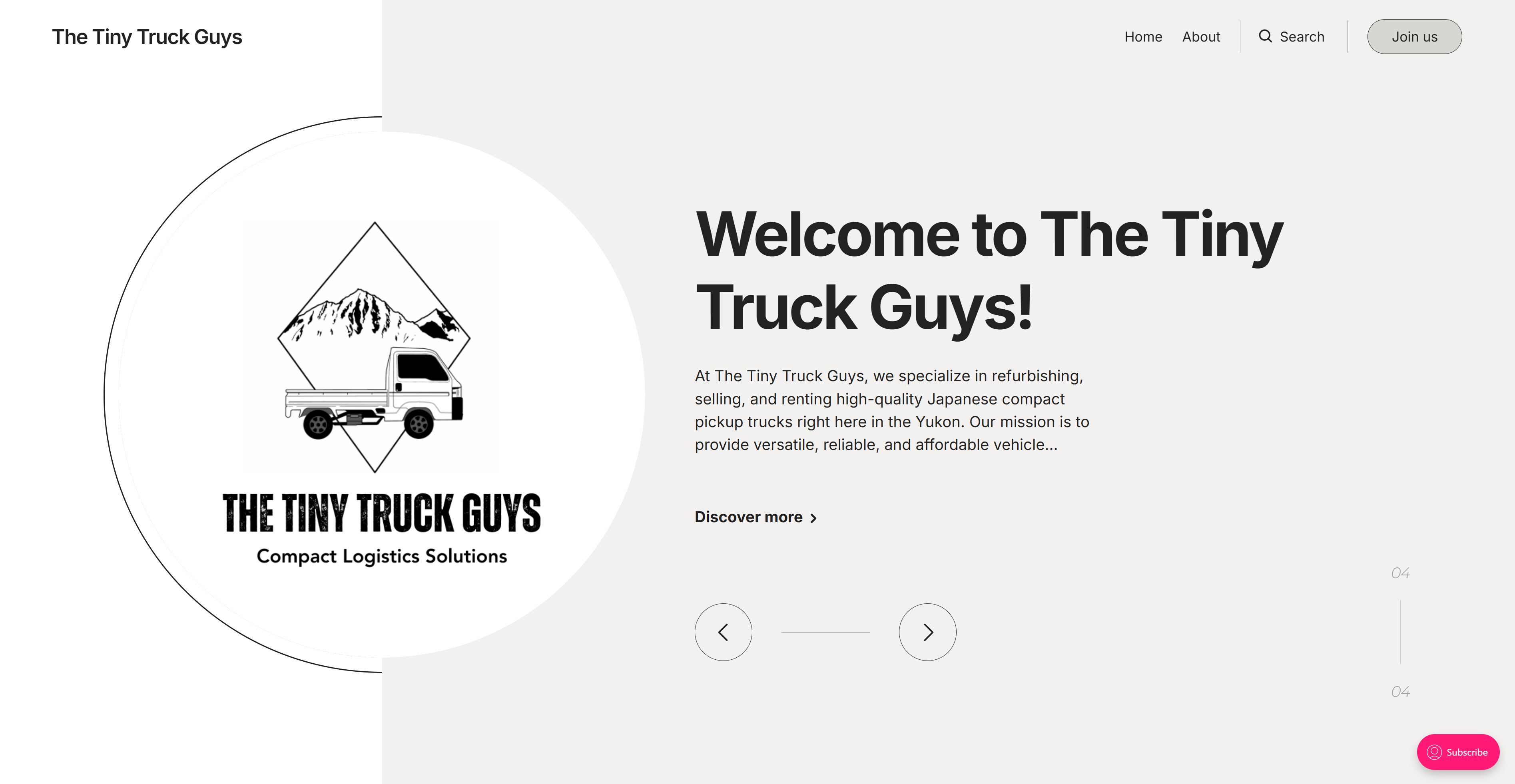
We tested it, fixed the bits that tripped people up, and shipped. It went live on time: a site that explains the kei truck, shows the range, and puts a clear next step in front of you: book a rental, ask a question, or buy.
The finished Tiny Truck Guys homepage
The Tiny Truck Guys. Brand & Web Designer, Joseph Kerr.