
Cavan
Barbell
Brand & Web Designer
A bodybuilder who lives on the road wanted one home for two lives: lifting and travelling. I built him a brand and a blog that holds both without looking busy.
Where I Started
Two passions,
one problem
The easy version of this brief is to give fitness and travel a section each and hope they get along. That is how most of these blogs end up: two websites wearing the same jumper.
Cavan wanted minimalist, and minimalist is the hard bit. The moment you push two big themes together, everything wants to get louder.
Minimalist isn't what you put in. It's what you're brave enough to leave out.
So the real job wasn't "design a fitness blog with some travel on the side". It was finding the one small idea that makes both feel like the same person.
01 · The Brief
Two worlds that don't
usually share a wall
Cavan trains seriously and travels constantly. His followers come for one or the other, and often both. The site had to serve all of them without feeling like a compromise.
Behind the good-looking blog were three real problems to solve.
Two audiences, one page
Gym followers want workouts and food. Travel followers want places and tips. The layout had to give both a clear run.
Minimalism fights clutter
Two strong themes pull towards busy. Keeping it calm meant cutting hard, and cutting often.
No brand to lean on
There was no logo and no look yet. The mark had to say fitness and travel in one glance, and still feel simple.
02 · The Work
How I got from
brief to brand
Work out who I was designing for
What I did
Before any layout, I built two personas from the audience: the fitness follower and the travel follower. Real goals, real frustrations, and what each one wants in the first ten seconds on the page.
It kept every later choice honest. When two ideas competed, I asked which person it served, and the answer was usually obvious.
Design for a vague "everyone" and you please no one. Two clear people gave every decision a reason.
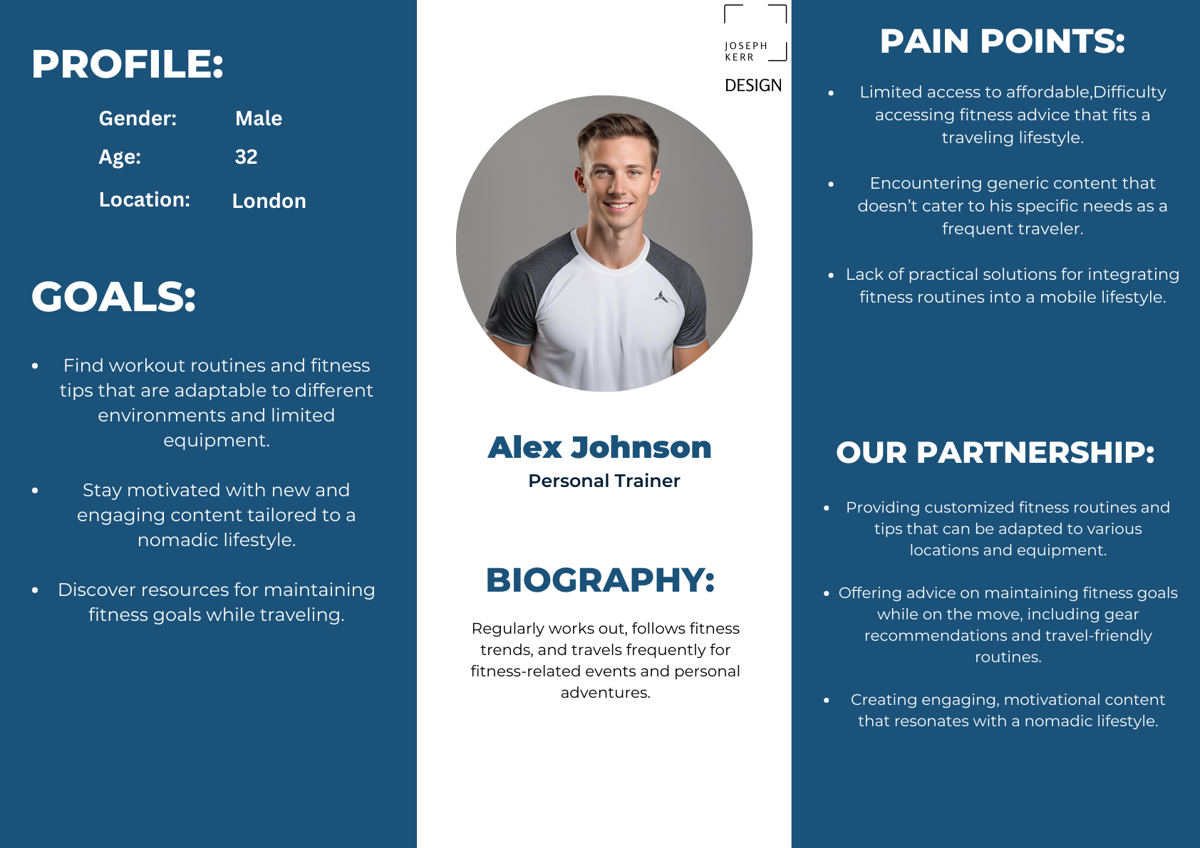
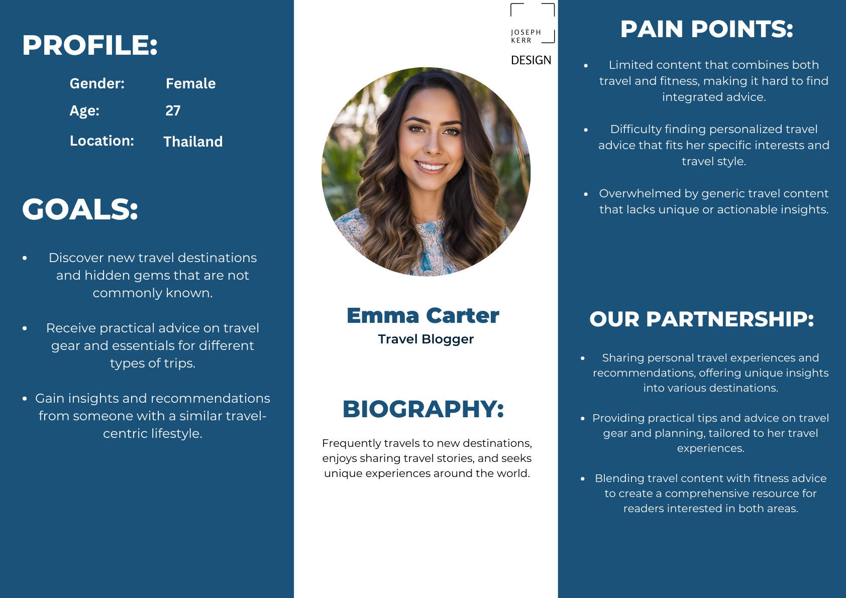
Two personas: the fitness follower and the travel follower. Click to view full size.
One mark that says both
What I did
The logo had to carry fitness and travel at once. I sketched a lot of versions that tried to say everything, and they all got cluttered.
The winner is a barbell with a GPS pin and a small plane tracing a flight path along the bar. Lifting and travelling, read in a single line.
We tried adding more to the logo and it only got convoluted. Taking things away is what finally made it work.
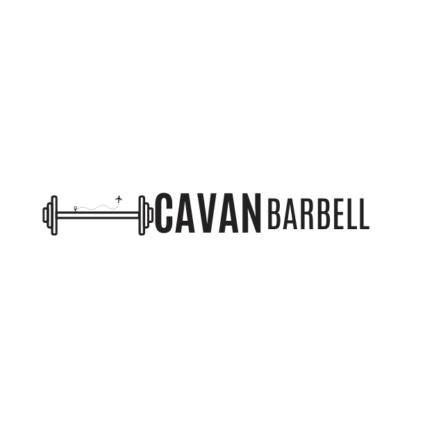
The final mark: a barbell, a pin and a plane in one line
Test the layout on paper first
What I did
I sketched the homepage, the article layout and the two section pages by hand before touching a screen. Paper is the cheapest place to be wrong.
The wireframes settled the big calls early: where the split between fitness and travel lives, and how a reader moves between them.
Fixing a layout in pencil takes a minute. Fixing it in a built WordPress theme takes a day.
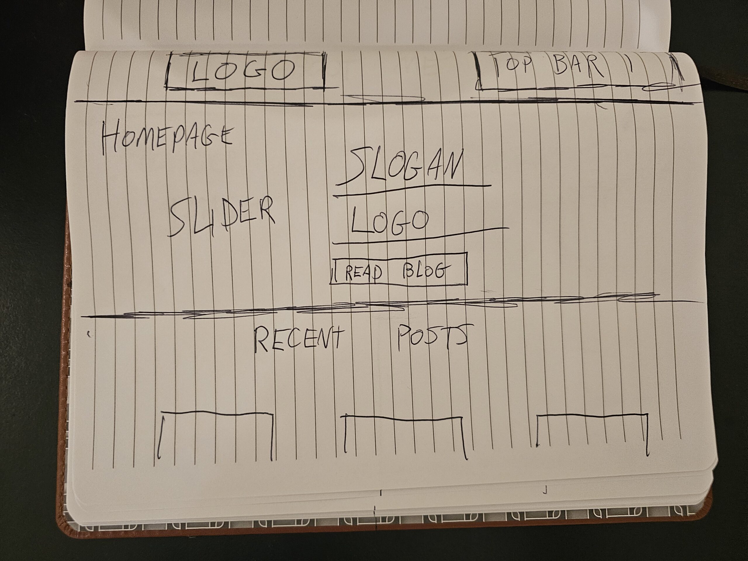
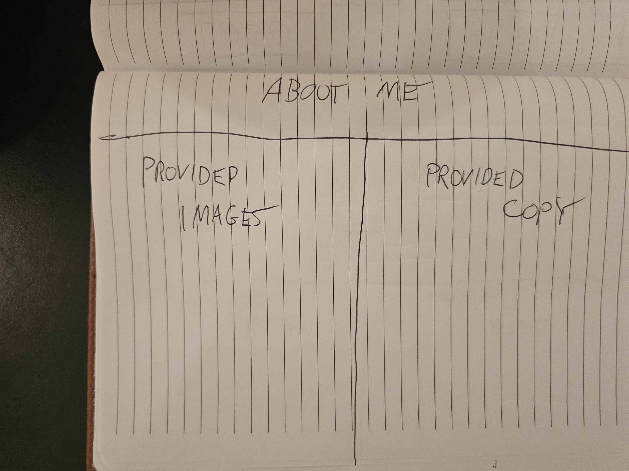
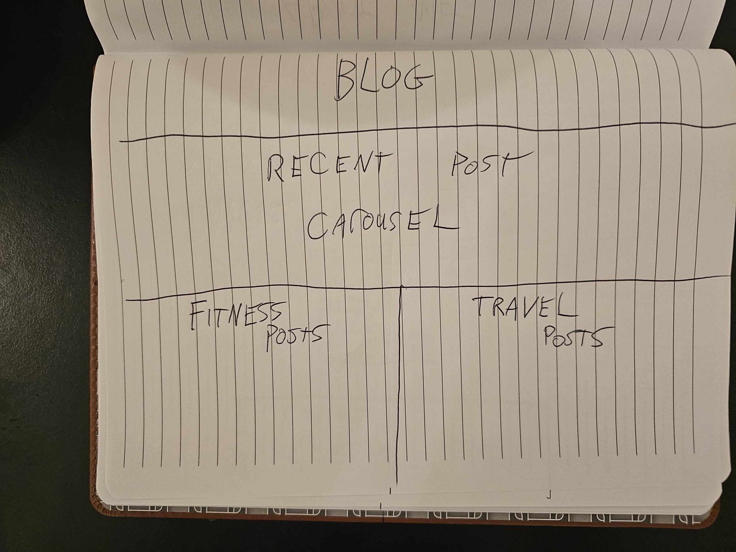
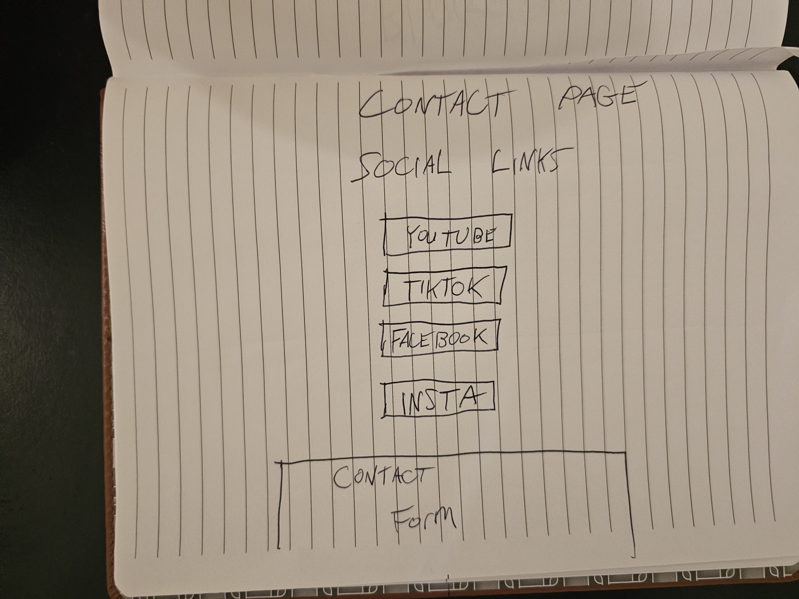
Homepage, articles and the two section pages, sketched by hand
The Plan On One Page
The whole thing,
mapped in one view
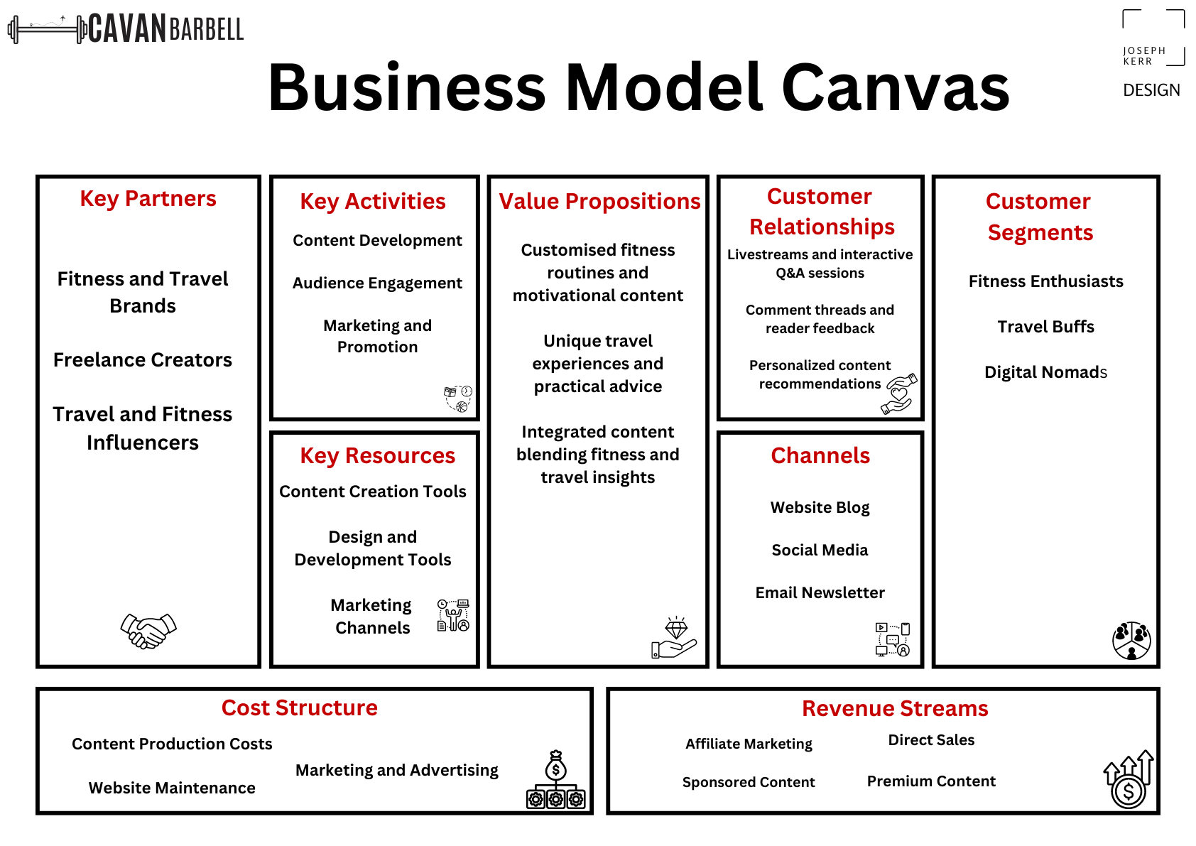
Before building, I laid the project out on a business model canvas: who it's for, what it offers each audience, and how the two halves feed one brand.
It became the reference I checked the design against. If a screen didn't serve something on this page, it didn't earn its place.
Audience, offer and channels, all in one frame.
03 · Why It Works
Two worlds,
one calm brand
The finished blog runs fitness and travel side by side and still feels like one person. The groundwork is why: real personas, one honest logo, and layouts tested cheap before anything was built.
Two passions × one restrained system = a blog that feels like him, not like two.
04 · The Design
Minimalist, and built
to stay that way
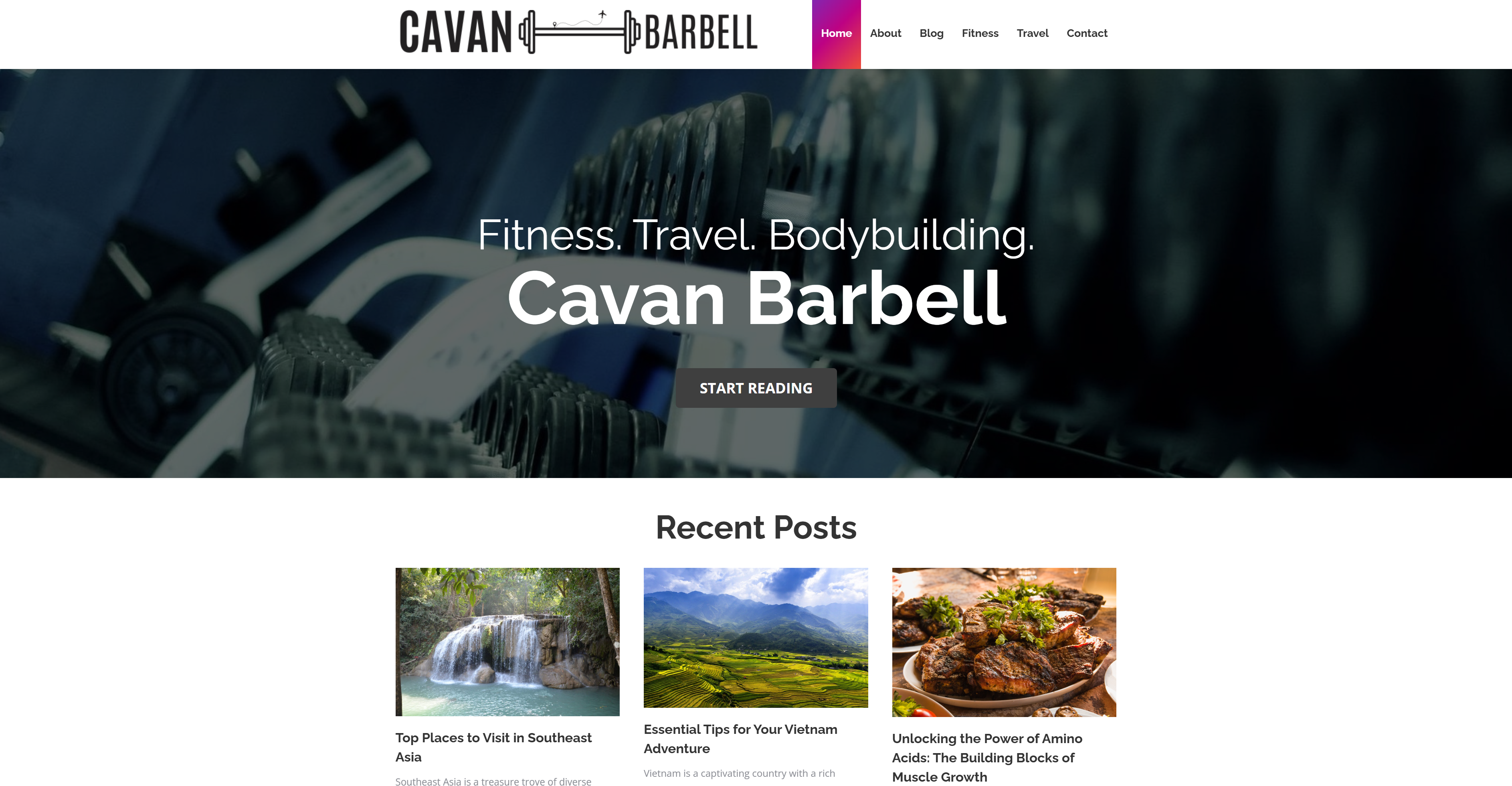
With the thinking settled, the look was almost the easy part. Plenty of white space, one clean type system, and a fitness-and-travel split that never shouts. Fitness. Travel. Bodybuilding. Then straight into the posts.
The blog splits its feed into recent fitness posts and recent travel posts, so each audience finds its lane without the other getting in the way.
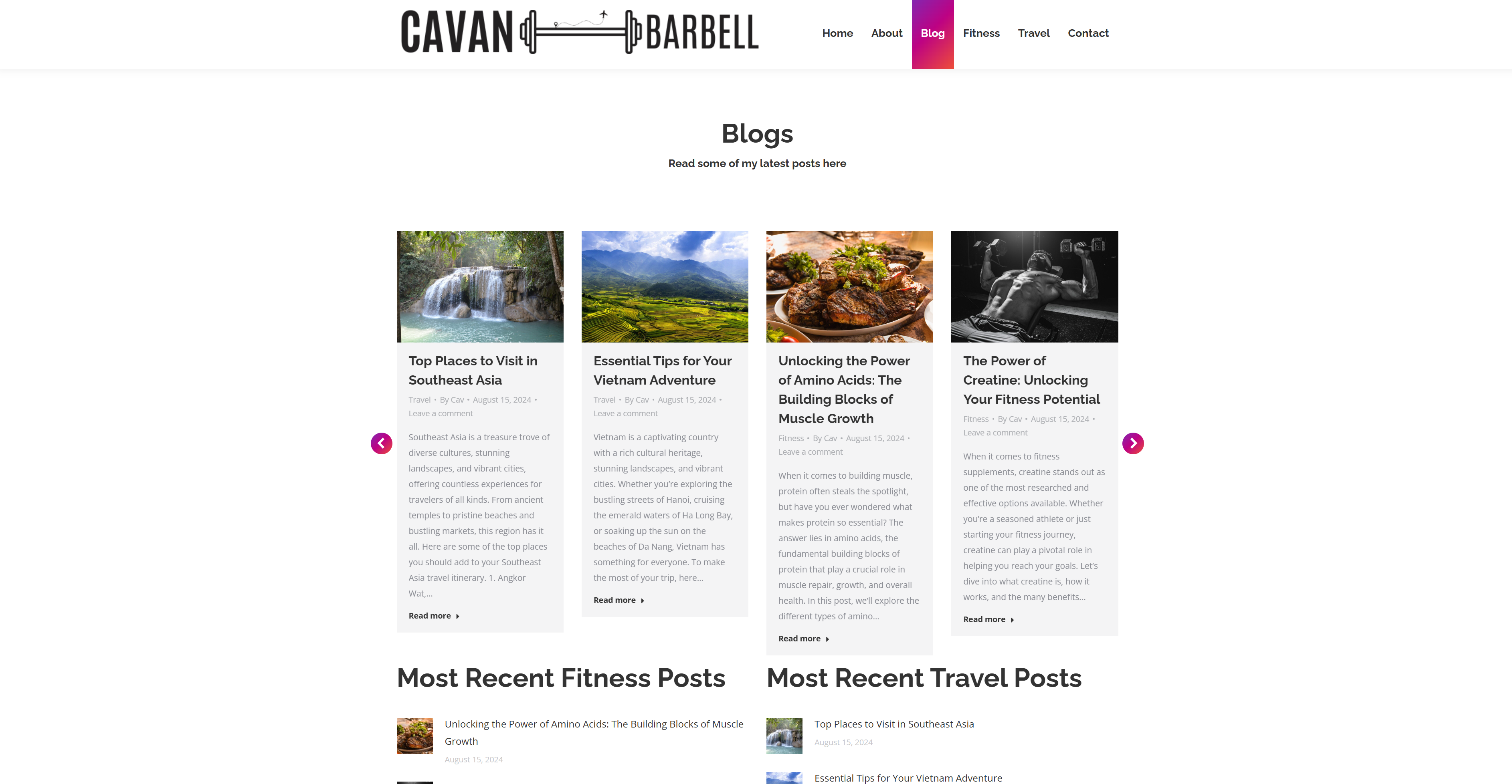

The same system carries the About, Fitness and Travel pages, plus the article template every post sits in.
And a guidebook to keep it that way
Rules so it stays this clean
A design system only holds if the person posting every week knows how to use it. So I wrote Cavan a short brand guide, plain enough to actually follow, covering the calls that quietly make or break the look once I've handed it over.
- Images without the mess. How to size, crop and place photos so a new post never breaks the minimalist feel.
- How to run the content. A simple way to write and structure posts so fitness and travel stay balanced.
- Tagging that makes sense. How to tag and categorise each post so it lands in the right feed, not both.
- SEO, the easy wins. A handful of practical tips to help the right people find the posts.
05 · The Outcome
From a sketch
to a live site
I prototyped the full site and walked Cavan through it. His notes were sharp and useful: split the fitness and travel pages out of a single blog link, and swap the slider images for his own shots from Southeast Asia and the gym.
The build had one proper fight. The hosting locked down the folders I needed, so once I had access I reset it and rebuilt the site clean. It launched minimalist, on brand and easy for him to run.
The finished Cavan Barbell homepage
Cavan Barbell. Brand & Web Designer, Joseph Kerr.