


The Situation
This is a snapshot of some of my work with the natural healthcare brand, Soetik. When they decided to expand their product line from one product to 47 and launch a campaign on Amazon, I was given the opportunity to overhaul their old website and ensure it had consistent design elements and great usability.
The initial site, pre-product launch had a handful of design issues. There was really no need to retain much of the design with the exception of some of the color palette as it was tied to the branding. So a complete reinstall was done of the site to get things back to basics. Here is the old site for reference:
The Old Site
DESKTOP

MOBILE
As you can see, there’s a handful of issues with contrast and sizing. I wouldn’t say the responsiveness was ideal either. Luckily, we got to skip the headache of fixing these issues individually because we will be working from a fresh perspective. We’ve wiped the site, hired some VA’s to upload all our product information and have thrown together a basic homepage.
Here is what we have to work with now we’ve restarted the site:
1ST DRAFT – NEW SITE
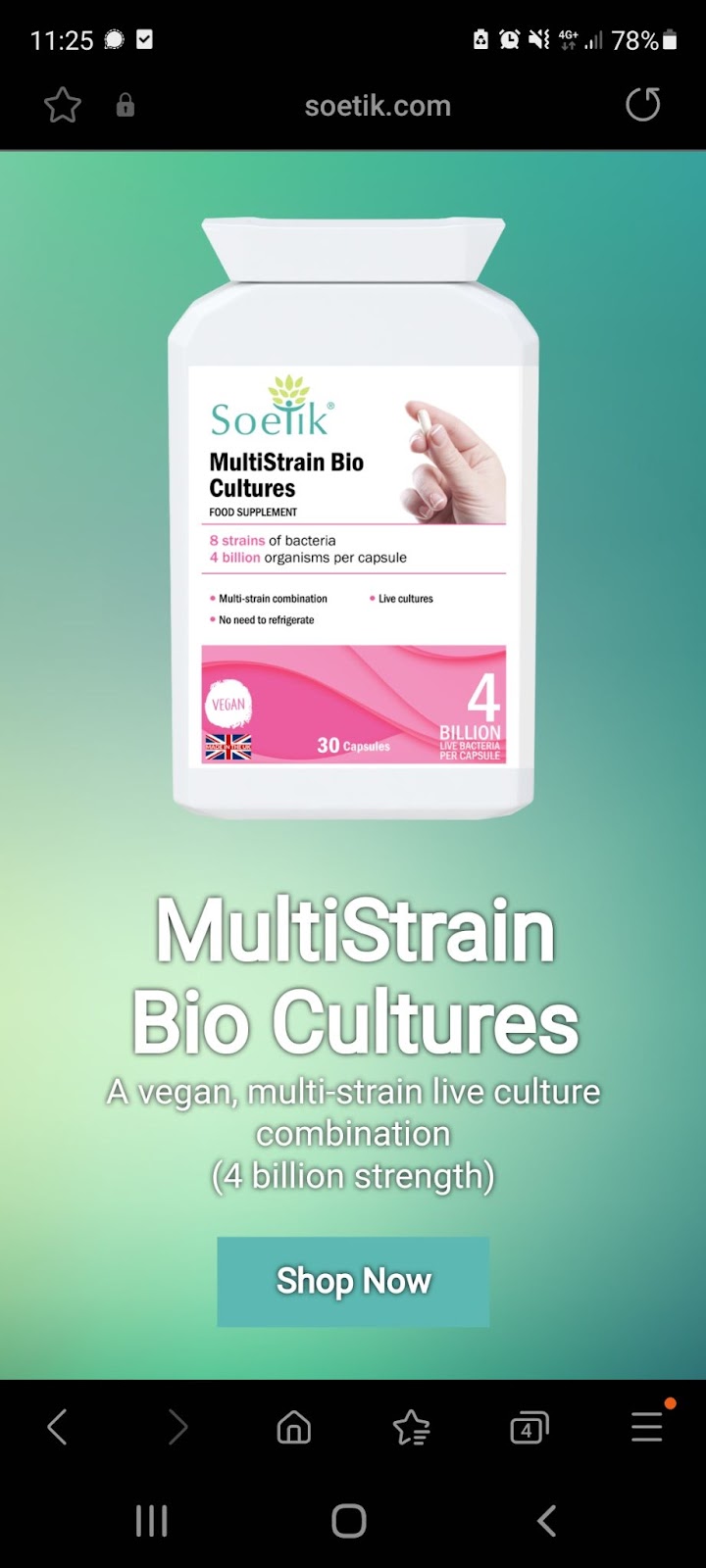
Desktop
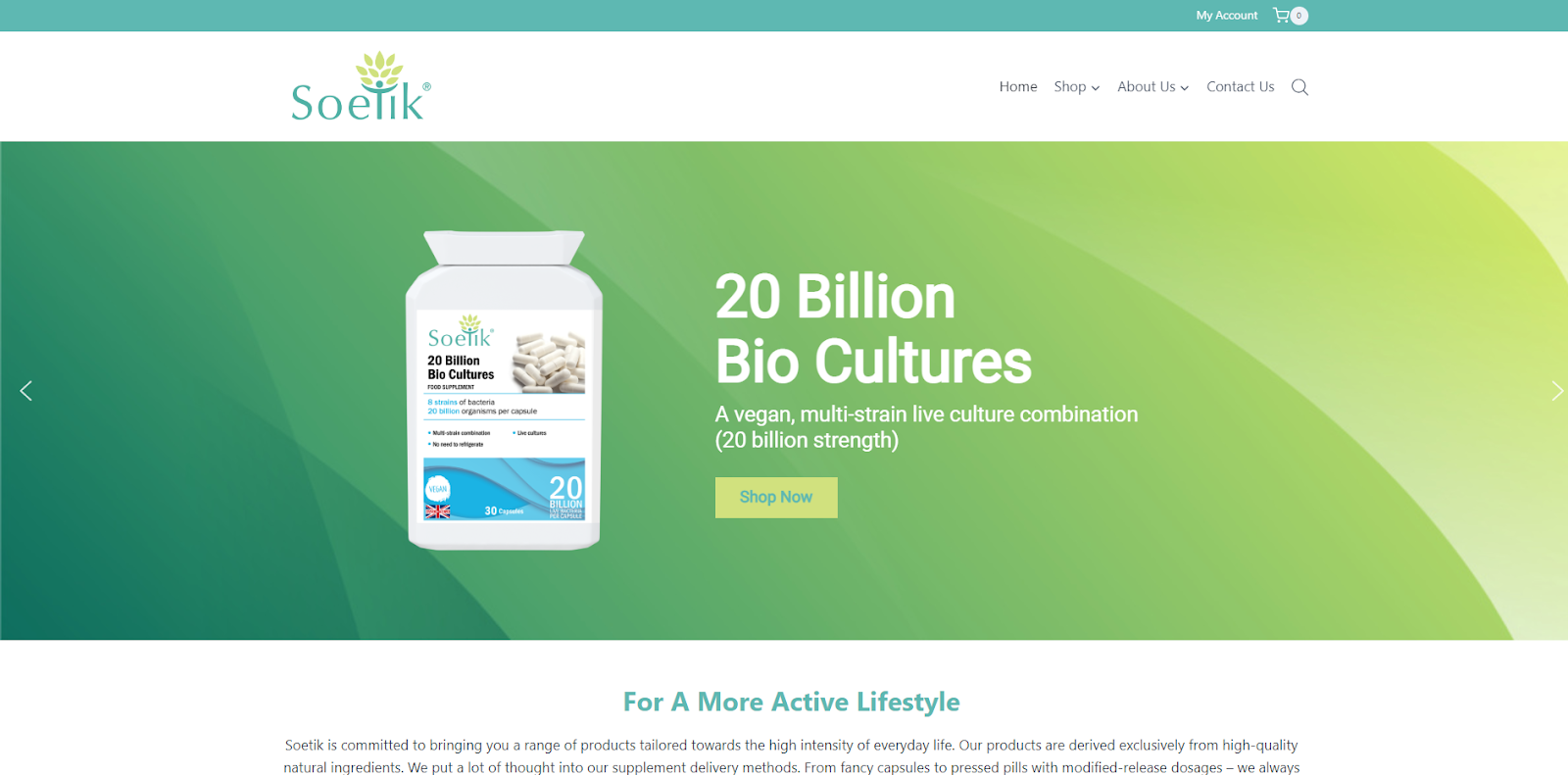
It’s less ‘busy’ and less likely to fatigue users. There’s also greater contrast when it comes to the content on-screen. But there’s still room for improvement. The blue text permeating some of the “shop now” buttons is low contrast. This could present an issue for users with poor eyesight and can even damage search rankings as google penalizes you for low contrast design elements. We can fix this by adding an outline and maybe considering changing the color.
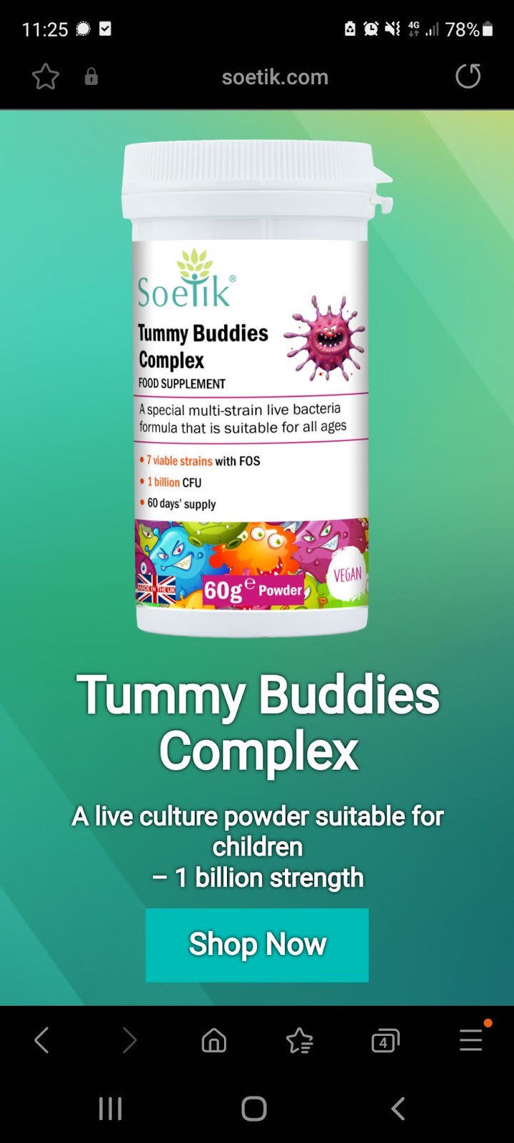
Now we need to have a look at the mobile responsiveness of the site. The vast majority of users who are going to be directed to this site will be using some sort of mobile device, so it’s important we maintain a “mobile-first” design philosophy.
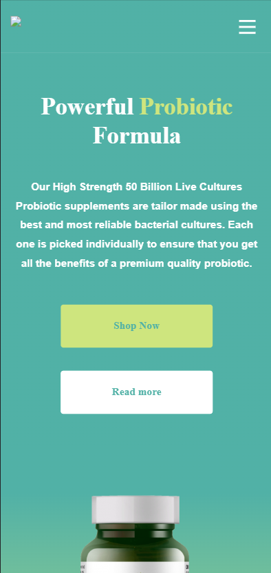
Mobile
 |
 |
The first thing I noticed is that the mobile responsiveness on the homepage smartslider is broken. I shouldn’t have to scroll down to observe the entire design element – it’s a waste of my time and the time of any user operating the site. You’ll note the shop now button is also still blue as I haven’t made any changes to the first draft of the site yet. The text could probably be center aligned too.
Let’s get to work fixing up the second draft of the site where I tackle some of the issues I identified above.
Mobile Optimisation & Desktop Template
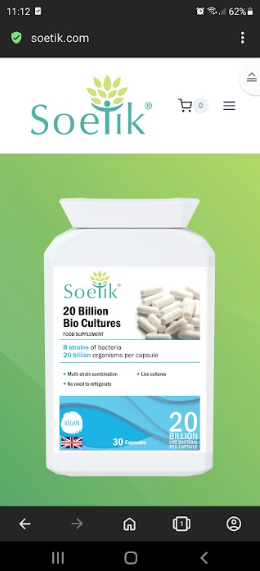
Armed with the knowledge of roughly what I needed to fix and roughly how I needed to fix it, I set off to optimize the website so that it would display properly on phones. Having scanned through the various phone sizes, I found that we had particularly bad problems on smaller screen sizes (see images above for an actual example from a real galaxy s8).
I spent a considerable amount of time planning out our responsiveness settings. Resizing, replacing and repadding different elements depending on screen size.
I finally reached a point where I felt I had achieved some sort of symbiosis between functionality and effort.
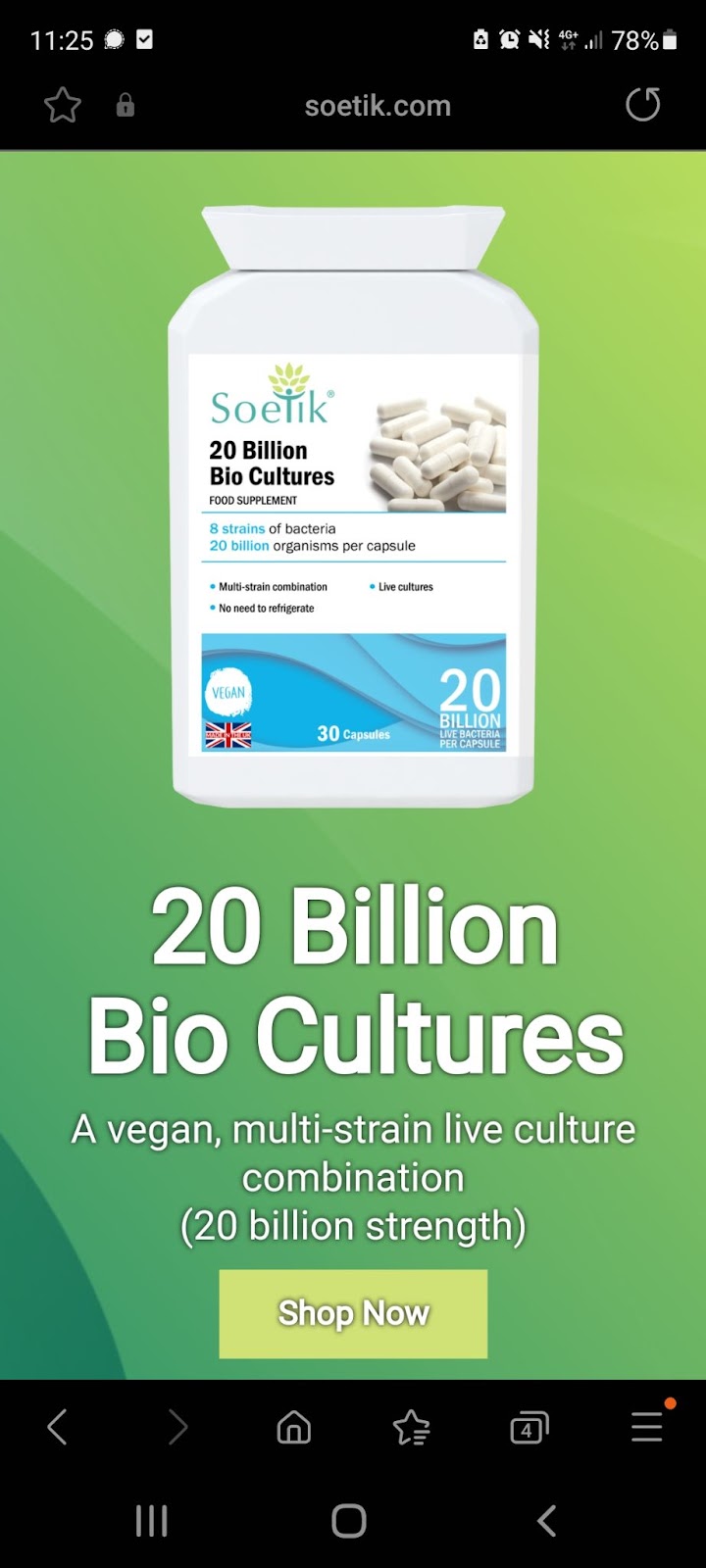
Mobile
It’s important to note that I haven’t even touched the microcopy yet and am currently ensuring the template I have to work with is useful for the future.
 |
 |
 |
Immediately this is a much more functional and responsive homepage slider. Most of the contrast issues have been eliminated, although arguably the contrast could be improved again.
Let’s have a look at the desktop site too.
Desktop
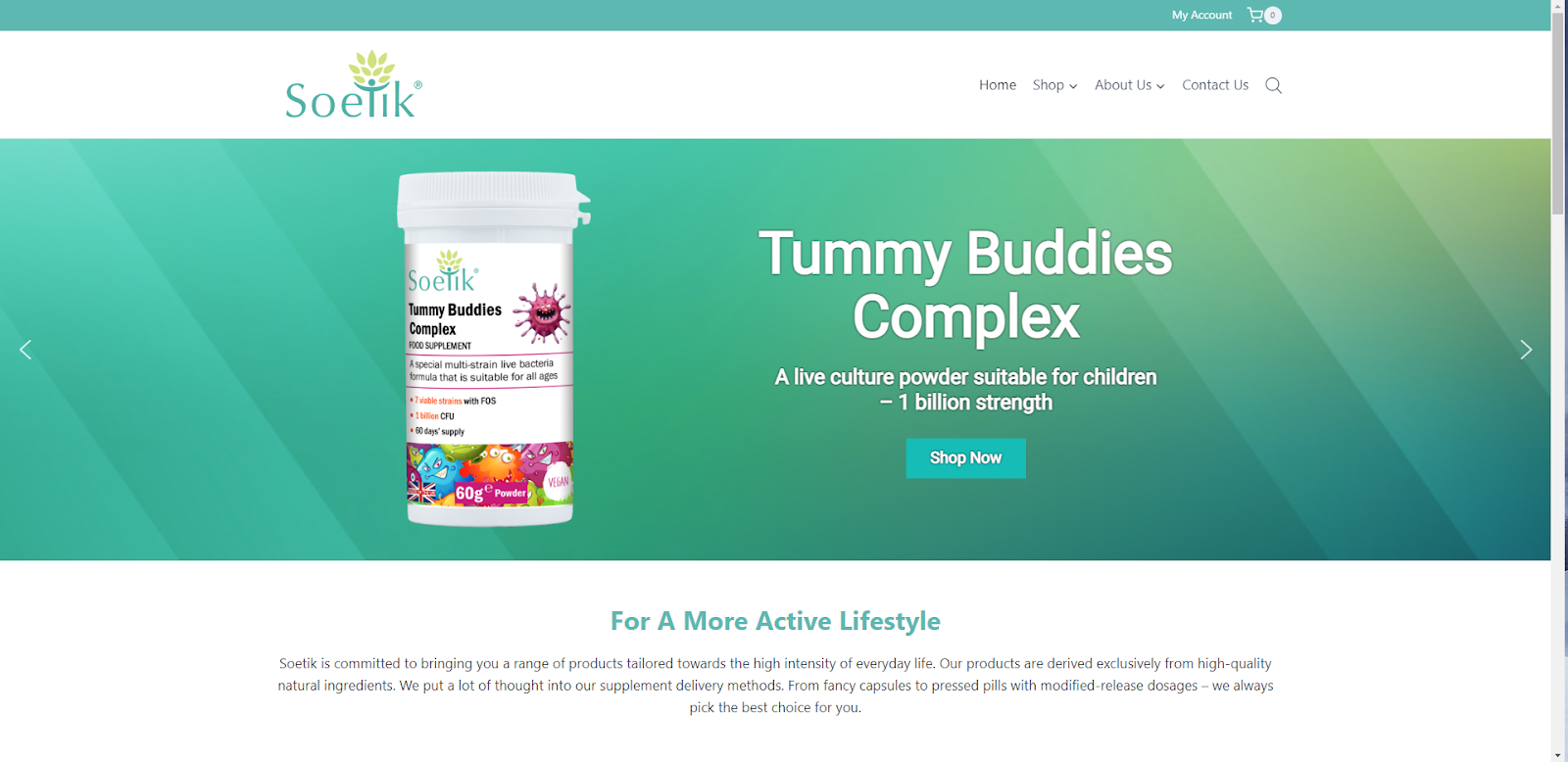
We’ve introduced a 400px limit on the desktop slider to allow people to read some microcopy below it, which is yet to be finalized along with the slider microcopy and contents.
Another Issue – MENUS
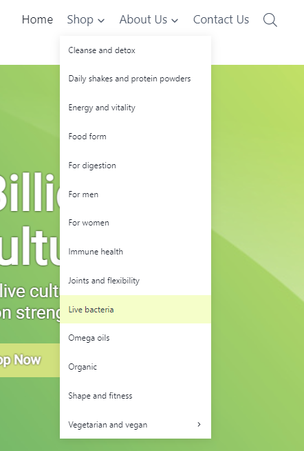
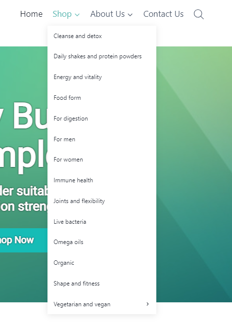
There’s a fairly diverse range of product categories on this website. When we rebooted the site, the VAs threw them all up and didn’t give much consideration to the menus. This has resulted in a navigation menu with simply too many options. At the absolute maximum, people can only really hold about 9 items in their working memory at a time. (See: the rule of 7 +/- 2 for reference)
As such, this massive menu is going to be confusing for users and contribute to fatigue. This is likely going to have a negative impact on our bounce rate, damaging our search rankings and costing us valuable sales. It’s also going to damage our mobile optimisation as it’s impossible to cram the whole list into a tiny phone screen. See the desktop sized menu on the left and the mobile sized menu below:
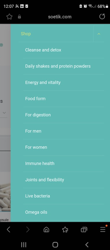
As you can see, it’s an eyesore. Luckily this is a simple fix. We just need to create some subcategories to slot a few of these categories into.
I’ve decided to take this opportunity to showcase how useful AI can be when it comes to tackling organizational problems like this. Instead of wasting time mulling over how exactly I can curate these menu items – I have a simpler solution. I’m going to feed a prompt into chatGPT, and ask it to observe miller’s law as it restructures the menu items.
Here’s my prompt incase you want to do something similar in the future:

And here was the result I got:

Now, the inclusion of the word health is not great, but all I really need to do is change this word to ‘support’ and we’ve solved our little menu problem in seconds.
Now here’s the before :
Here’s the after:
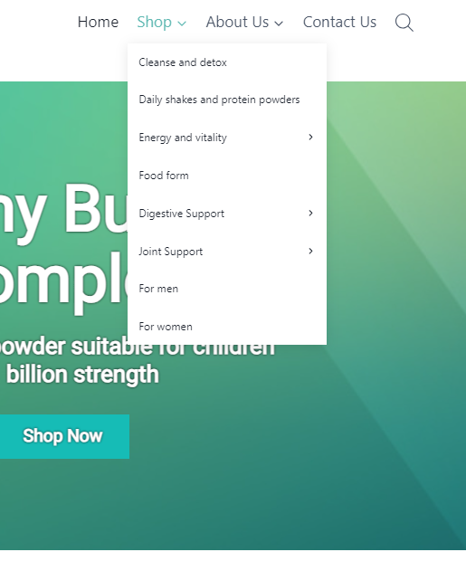
A massive improvement. Now let’s check the mobile.
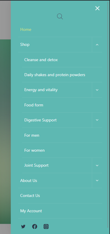
We have a winner. The side menu now fits on the mobile screen with ease and our navigational structure is less confusing and taxing for users.
Other design issues I cleaned up:
I got to work fixing a handful of the more general tedious problems. Ensuring there was a solid internal linking structure and looking out for broken links or any other issues that could’ve occurred during their product onboarding process. Disabling dates on their posts to keep their content relevant etc.