Project Brief

Company Overview:

The Tiny Truck Guys is a Yukon-based company that specializes in the importation and conversion of Japanese kei trucks, a unique class of small, lightweight vehicles popular in Japan. These trucks are perfect for the Yukon’s harsh, snow-covered landscapes when fitted with specialized snow tracks and other rugged modifications. The company offers these converted kei trucks for sale or rent, catering to a variety of customers, including adventurers, local business owners, and anyone in need of reliable off-road vehicles in remote areas. They also provide a range of modifications, such as snow plow attachments, making the trucks even more versatile for various needs.

Project Goals:
The primary goal of the website is to create a visually appealing and highly functional online presence that showcases The Tiny Truck Guys’ products and services. The website should serve as an informational hub where potential customers can learn about kei trucks, explore the benefits of these conversions, and easily browse vehicles available for purchase or rent. A seamless user experience is key, with clear calls to action (CTAs) leading visitors to book rentals, request more information, or make purchase inquiries. Additionally, the site should promote the company’s unique offerings, like custom modifications, and highlight how these trucks provide value to people living and working in extreme environments.

Target Audience:

The website targets a variety of user groups:

  • Outdoor Enthusiasts & Adventurers: Individuals looking for an off-road vehicle capable of handling the tough Yukon terrain, especially in winter months.
  • Local Business Owners: Small businesses and operators (e.g., hunting lodges, maintenance services) in need of durable, multipurpose vehicles that can operate in harsh conditions.
  • Customisation Seekers: Customers interested in modifying a base kei truck with custom options, such as snow plows, utility racks, and other add-ons to meet their specific needs.
  • Remote Residents: Individuals in isolated locations needing a reliable vehicle that can navigate difficult snow-covered or off-road areas.

Key Challenges:

– Educating potential customers on the benefits of Japanese kei trucks, especially their affordability, fuel efficiency, and adaptability to rugged environments like the Yukon.
– Demonstrating the value of renting vs. purchasing, depending on the customer’s use case (short-term rentals for adventurers vs. long-term ownership for businesses).
– Ensuring the website remains fast and user-friendly, even with image-heavy content like galleries of available trucks and modification options.

Special Requirements:

  • Client needs website built before first truck purchase in under a month.
  • Client wants to make full use of the GHOST CMS within their own domain that they host personally. It is fairly similar to WordPress but more lightweight and requires more CSS knowledge for higher customisability. It DOES offer templates so if we’re pressed for time we can design our site AROUND a template rather than working from scratch. 

Problem Statement:

The Tiny Truck Guys need a comprehensive website to properly showcase their unique offerings and stand out in the niche market of kei trucks and rugged vehicle conversions. The website should make it easy for potential buyers and renters to understand the benefits of these trucks, explore available options, and ultimately make inquiries or bookings. The website also needs to reflect the company’s adventurous, rugged brand identity, capturing the spirit of exploration and resilience that these trucks represent.

Phase 1 – Understanding

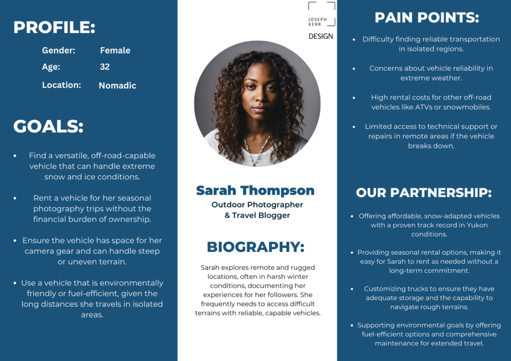
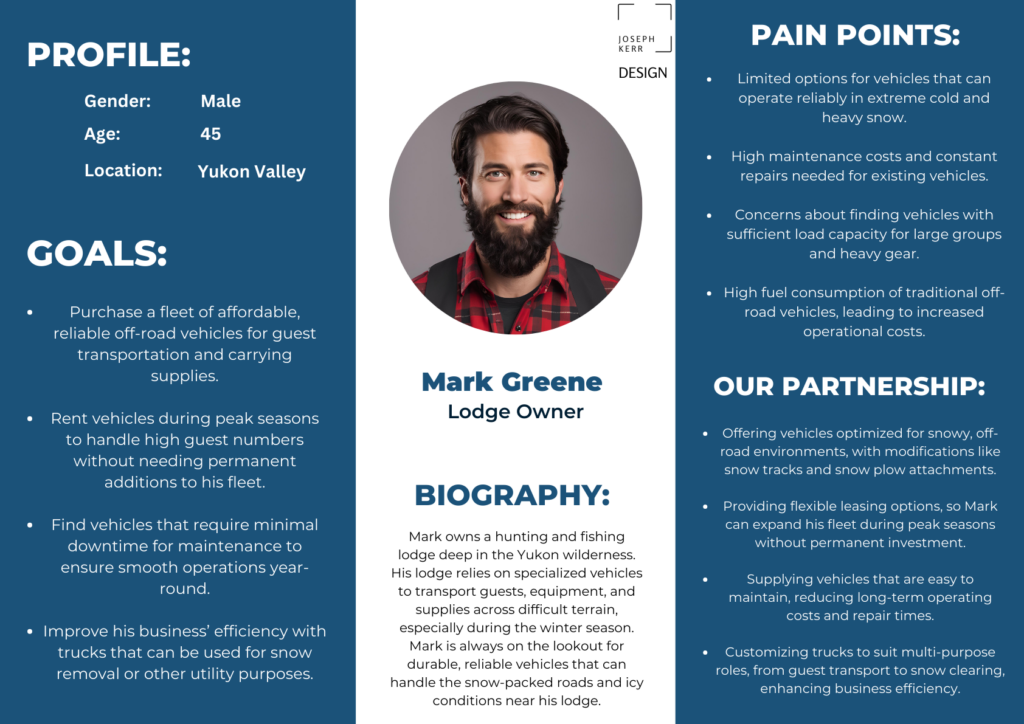
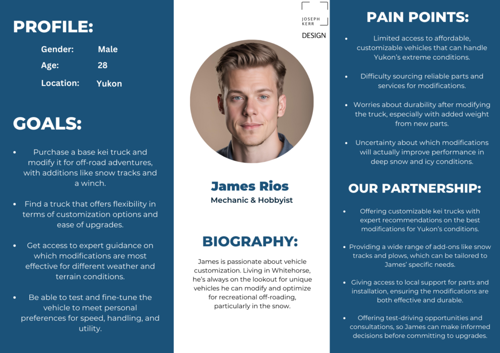
it’s important before we set off to design anything that we generate an understanding for our customers and are able to emphasise with them efficiently. One of the tools we can use for this is user personas.

User Personas

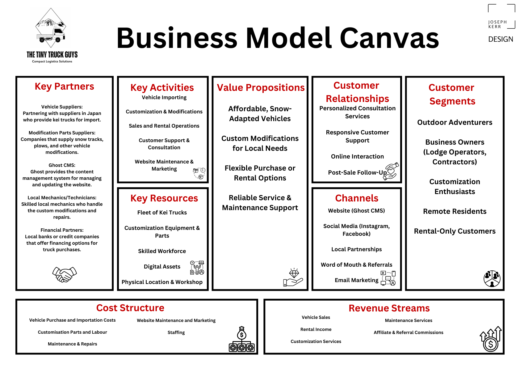
Phase 2: Defining Stage – Introduction to the Business Model Canvas

Now that we have a deeper understanding of our client’s customers and the market they’re operating in, we can draw upon our findings to define a point of view and craft a potential approach to tackling the challenges at hand.

One effective method we can use to explore the problem domain and solidify our understanding is by generating a Business Model Canvas. This tool will help us map out the key aspects of the business, clarify our strategy, and ensure we align with both the client’s objectives and the needs of their customers. The Business Model Canvas for this project looks as follows:

Phase 2: Ideation –  Wireframes and Logo Design

With a solid foundation of insights from our research and a clear direction established through our Business Model Canvas, we can now move into the ideation phase. This stage is all about transforming ideas into tangible designs that bring our approach to life.

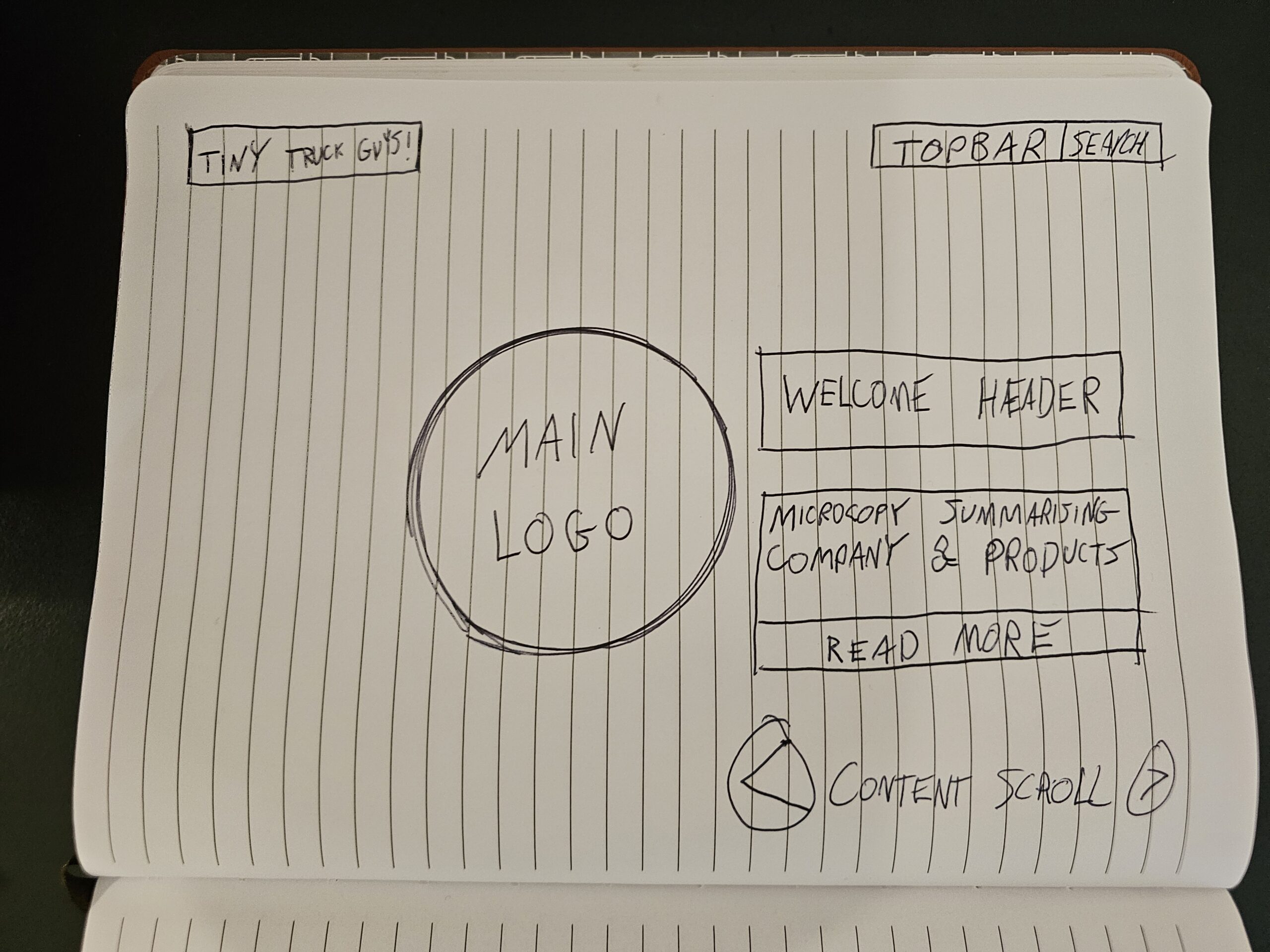
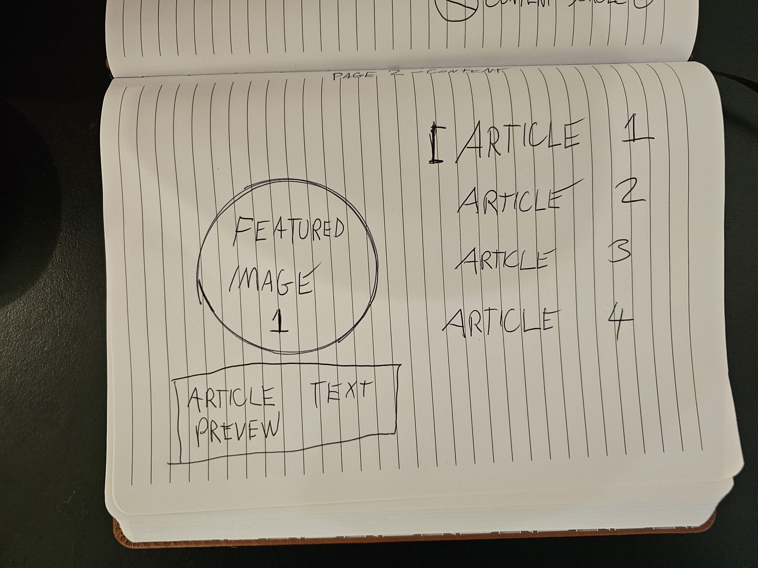
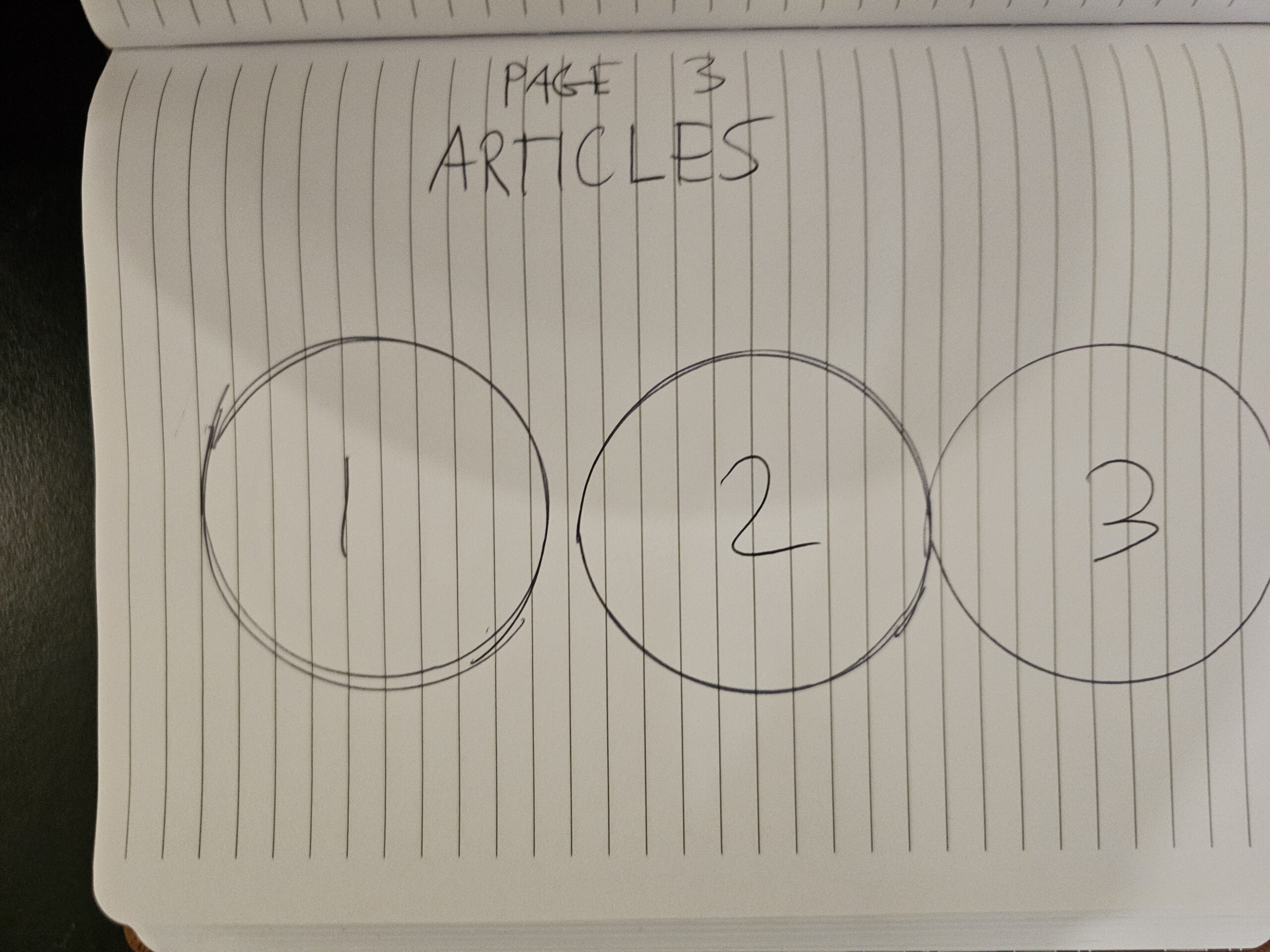
One of the key methods we use to visualize these ideas is by creating wireframes, which help us map out the user interface and structure of the website. These early sketches allow us to explore different layouts and ensure the user experience aligns with the client’s goals.

Additionally, we’ve started refining the brand identity by working on logo concepts, ensuring it reflects both the company’s unique offerings and resonates with its target audience. Below are the wireframes and logo designs that represent the first steps toward bringing this vision to life:

Logo Design

After a brief conversation with both owners of this business, it was made clear to me that they had a few very specific requests for their logo. Obviously, working within constraints means our creative capacity is somewhat limited – but this isn’t always a bad thing.

Logo requirements:

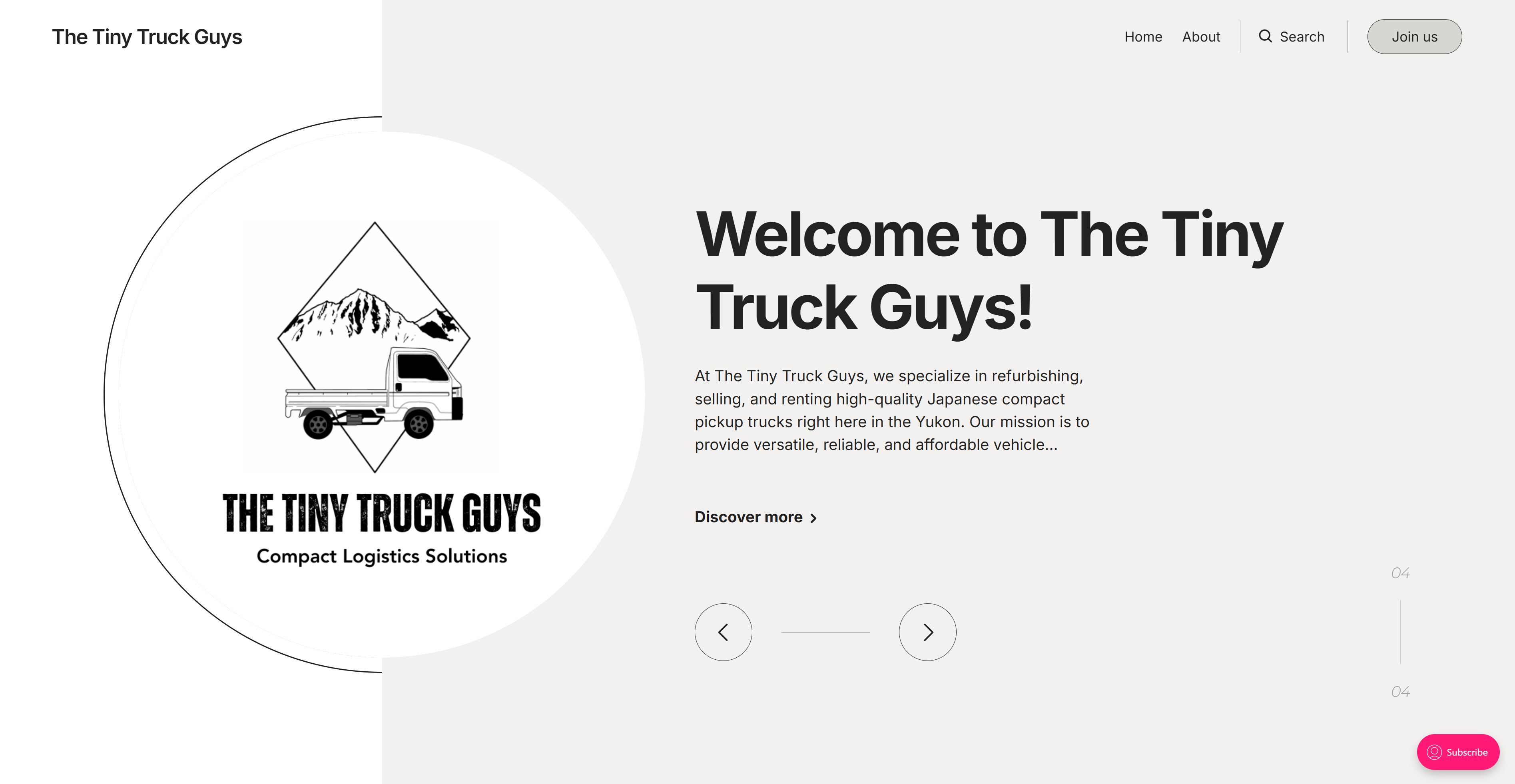
The logo must adhere to a fairly common design trend from this region in the Yukon, which is to include some sort of graphic depiction of the Yukon mountain range.

The logo must also include a drawing/clip art that one of the business owners had already created themselves. This drawing was a depiction of a Kei truck.

Finally they told me I could do whatever I want in terms of composition/typography.

Key challenges here were:

Simplifying the relatively complex foreground clip art I had been provided with to fit with the more simplistic badge in the background. Achieved this with colour reduction, manually rebushing and a couple other handy tricks in Photoshop. The background badge I generated manually with AI.

I picked a bold, large industrial font for the logo text, this was an attempt to convey the reliability and sturdiness of the product. The secondary font was picked purely for it’s relatively good legibility across various scaling options.

Wireframes: Rapid Conceptualisation with Pen and Paper

To expedite the ideation process, I opted to sketch the initial wireframes by hand, allowing for quick iterations. These wireframes are based on the structure of a pre-existing Ghost template, the ‘Circular Theme,’ which provided a foundational layout that I adapted to fit the client’s specific needs.

Phase 3 – Prototype: Medium/High-Fidelity Design in Figma

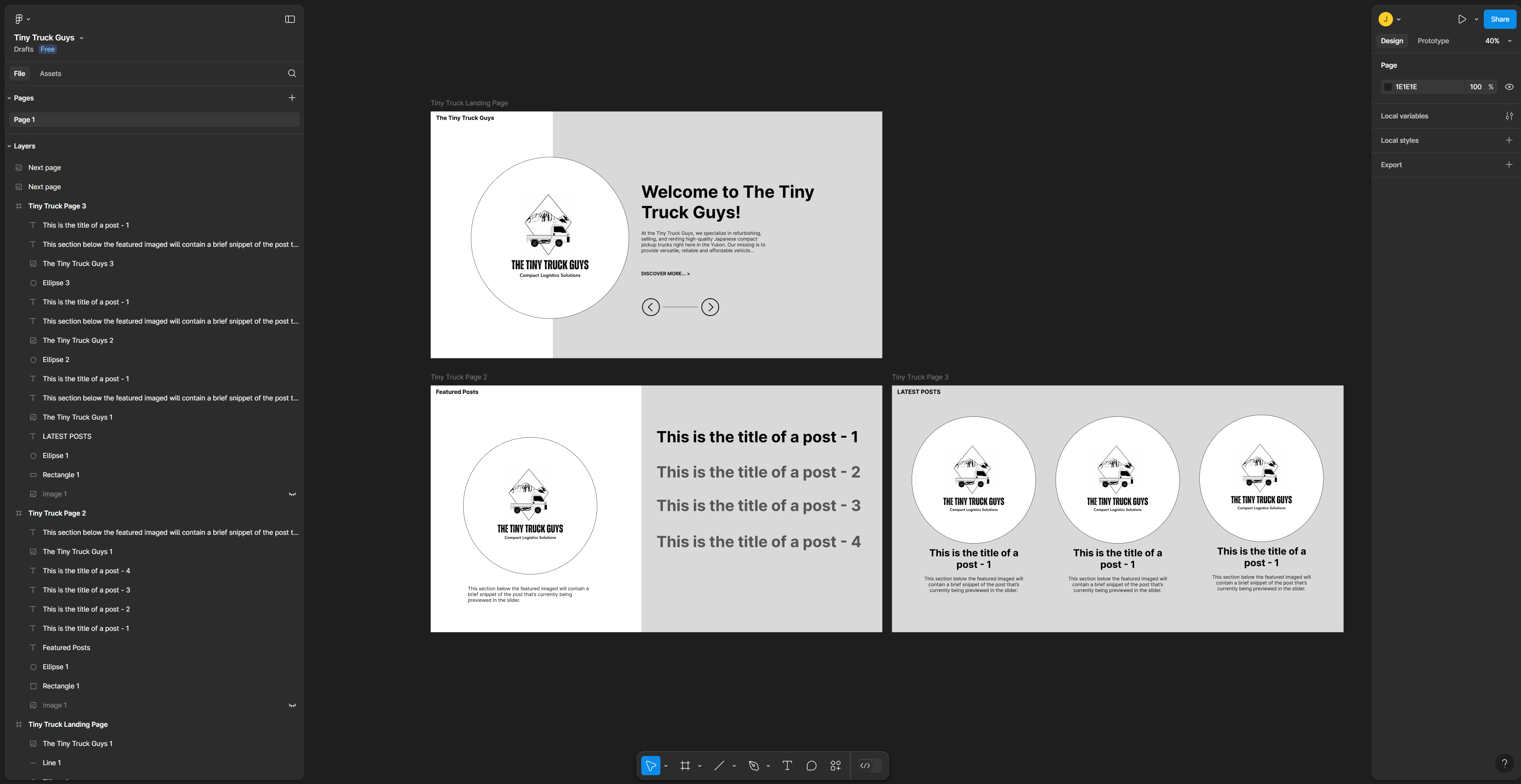
Building on the initial wireframes, the next step involved creating medium/high-fidelity prototypes in Figma. These designs present a more polished version of the user interface, incorporating refined layouts, key interactive elements, and a clearer visual representation of the final product.

Working from the ‘Circular Theme’ template as a foundation, I customized the prototypes to fit the client’s specific branding, content, and functionality needs. These medium/high-fidelity versions allow for a more detailed exploration of the user experience while still offering flexibility for changes based on feedback.

The Figma prototypes act as a critical step between conceptualization and development, offering a tangible, testable design that we can continue to refine.

Phase 4 – Final Build & Testing

In the final phase, we brought everything to life by integrating the Ghost CMS, using the ‘Circular Theme’ we had planned around from the start. This allowed us to build the website’s structure as intended, ensuring a seamless experience for users.

To populate the website with engaging content, we employed a hybrid approach to microcopy generation. Leveraging the efficiency of large language models alongside my own manual copywriting skills, we crafted clear, effective messaging tailored to the client’s audience.

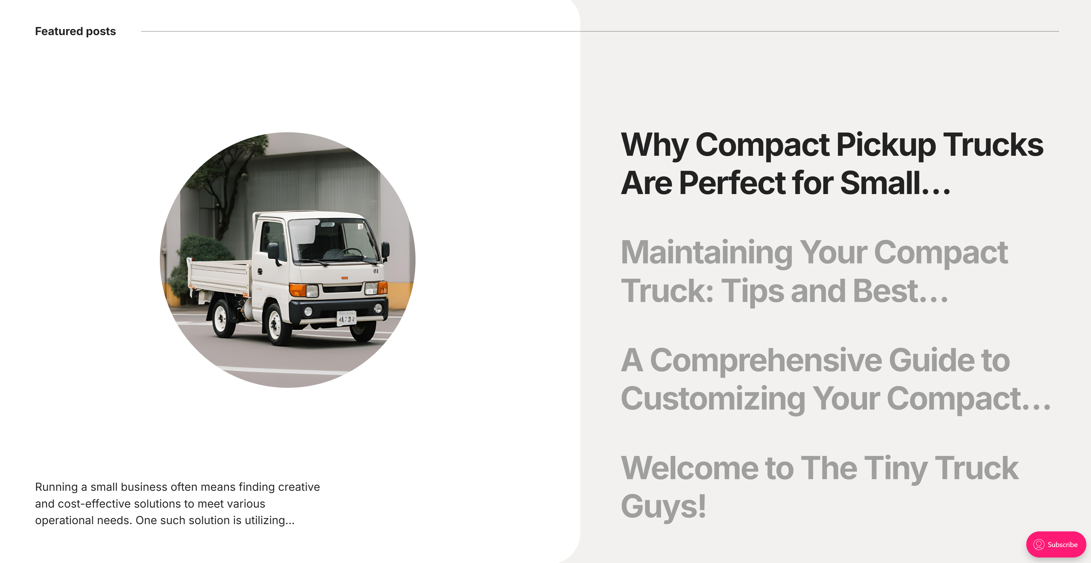
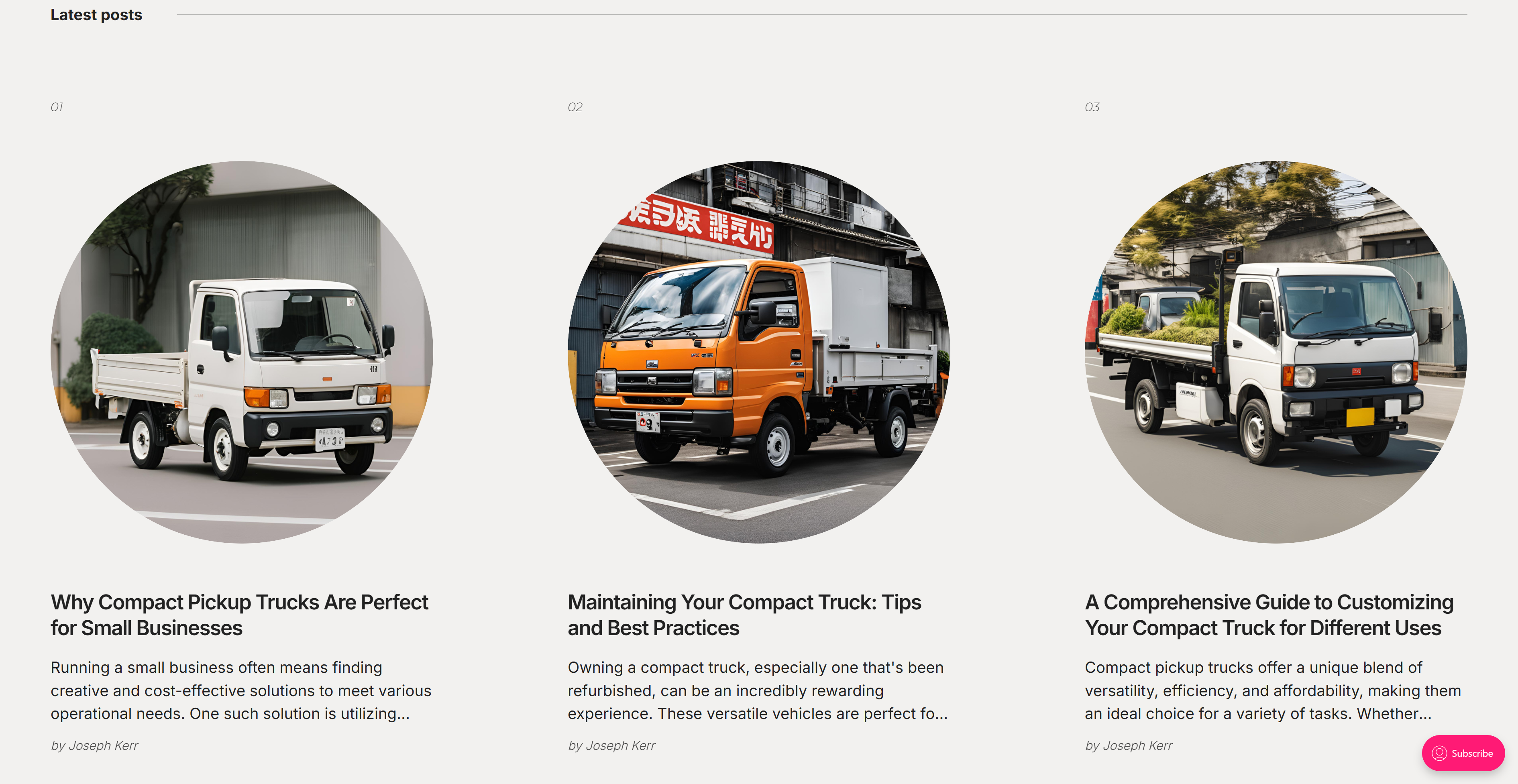
Given the lack of high-quality stock images for KEI trucks, we turned to generative AI to create custom visuals. These AI-generated images provided a unique solution, allowing us to showcase the vehicles in a way that complemented the website’s aesthetic and functionality.

At this stage, the entire website was rigorously tested for usability, ensuring that both the content and visuals aligned perfectly with the client’s brand and the user experience.