
Bungie as a company holds a special place in my heart. They produced some of the first games I ever played when I was a kid. I spent more time than I’d care to admit playing the early ‘Halo’ titles instead of playing outside. But the Bungie of today isn’t really comparable to the team of tech wizards we were blessed with in the early 2000’s. That’s not to say they aren’t still good at what they do – but they 100% have a wildly different corporate culture and set of goals as a company compared to their old self. When they released their new extraction shooter, “Marathon”, recently – it drew a lot of attention quickly. With that attention came a fair amount of criticism.
A first impression that quickly unravels
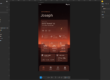
When Bungie first showed Marathon’s interface, the reaction was unusually consistent. At a glance, it looks bold and distinctive. Spend more than a few seconds with it, though, and that confidence starts to slip. The problem is not that it looks bad. It is that it becomes hard to read.
That gap between style and usability sits at the centre of the criticism. Players are not rejecting the direction outright. They are struggling to make sense of it in practice.
The “fontslop” problem
A lot of the conversation has been centred around the term “fontslop”. It sounds like a throwaway joke, but it points to something real. The UI leans heavily on a mix of fonts, sizes, weights, and decorative treatments that compete for attention instead of organising it.
In a static screenshot, that might pass as creative flair. In motion, it becomes noise. Text that should guide the player ends up blending into everything else. Instead of quickly recognising key information, you find yourself decoding it.
Typography in games is meant to be functional first. It should establish hierarchy and then quietly get out of the way. Here, it pulls focus. That is where things start to break down.
When everything is loud, nothing stands out
A good shooter UI is built around hierarchy. Some information matters more than the rest, especially in the middle of a fight. Ammo count, health, and immediate prompts should be readable almost without conscious effort.
Marathon’s interface often flattens that hierarchy. Too many elements feel equally prominent. Bright colours, layered graphics, and dense layouts all compete at once. The result is a kind of visual gridlock.
This is not just a matter of taste. It affects how quickly players can react. If you need even half a second longer to find what you are looking for, that has a direct impact on play.
The wider issue with overdesigned UIs
Marathon is not alone in this. There has been a broader shift towards highly stylised interfaces that aim to stand out as part of a game’s identity. UI is no longer just a tool. It is treated as part of the visual signature.
That ambition is understandable. Many games fall into safe, familiar patterns. Trying something different has value. The problem comes when visual identity starts to override usability.
Overdesigned UIs tend to share the same traits. Too many visual ideas layered together. Not enough restraint. A focus on how things look in isolation rather than how they function under pressure.
Marathon pushes into that territory. It feels designed to be looked at rather than used.
Typography that draws attention to itself
Fonts are where this becomes most obvious. In a well-balanced UI, typography helps players build recognition over time. You learn what certain sizes and styles mean, and that speeds everything up.
In Marathon, that consistency is harder to find. Different styles appear side by side without a clear purpose. Some text feels decorative rather than informative. It breaks the pattern recognition that players rely on.
Instead of reinforcing meaning, the typography becomes something you have to interpret. That adds friction where there should be none.
Colour, contrast, and clarity
The colour palette follows a similar pattern. It is bold and distinctive, but not always helpful. Important information does not consistently stand out from the background.
In controlled footage, you can take a moment to process it. In actual gameplay, that moment disappears. A combat UI should feel almost invisible because it lines up with how players think and react. Here, it risks pulling your attention away from the action.
Clarity is not about reducing everything to plain shapes and colours. It is about making sure the right things stand out at the right time. That balance feels off.
How this kind of design happens
It is worth asking how a UI like this makes it through development. Part of the answer lies outside games. There has been strong influence from graphic design trends, tech products, and branding work.
Bold typography and layered visuals can look great in posters or marketing. When those ideas are applied directly to interactive systems, they do not always translate cleanly. What works in a static image can become overwhelming in motion.
There is also the question of testing. Interfaces can look very different in isolation compared to real play. If most iteration happens in controlled settings, it is easy to miss how chaotic things feel when everything is happening at once.
The good news: this is fixable
UI problems are frustrating, but they are also fixable. Unlike core mechanics, they can be adjusted without rebuilding the entire game. Small changes can have a large impact.
Reducing the number of competing elements would be a strong start. Tightening up typography and establishing clearer hierarchy would help immediately. Improving contrast in key areas could make the interface far easier to read.
None of that requires abandoning the visual identity. It just requires more restraint.
A familiar tension in modern game design
Marathon highlights a recurring tension. Studios want to create something visually distinct. Players need something they can understand instantly.
When those goals fall out of balance, you get interfaces like this. Interesting to look at, but harder to use than they should be.
There is a strong foundation here. The direction is not without merit. It simply needs to be pulled back towards clarity. Right now, the UI feels like it is trying to say too much at once. The challenge is deciding what actually matters, and letting everything else step aside.