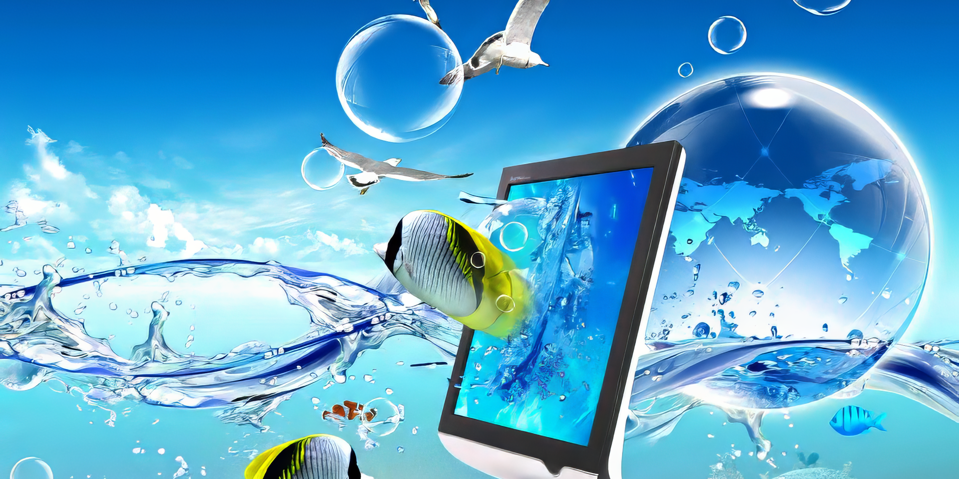
Over the past couple of years, Frutiger Aero has been creeping back into the cultural conversation. What once felt like a dated visual language from early smartphones, Windows Vista splash screens, and corporate sustainability ads is suddenly everywhere again. Mood boards on Tumblr and TikTok. Instagram accounts archiving glossy UI buttons and floating glass panels. Younger millennials and Gen Z, many of whom were kids or teens when this aesthetic first peaked, are rediscovering it with surprising enthusiasm.
For an aesthetic so closely tied to a specific moment in tech history, its revival raises an interesting question. Why now?
A Quick Reminder of What Frutiger Aero Was
Frutiger Aero is the look of the mid-2000s digital world. Translucent interfaces. Blue skies and soft gradients. Bubbles, reflections, and floating elements that suggested depth and tactility. It was everywhere, from operating systems to phone menus to ads promising a cleaner, greener future.
At its core, it was optimistic. Technology was framed as friendly, helpful, and in harmony with nature. Digital spaces were meant to feel soothing rather than efficient. It was not subtle, and it was not shy about that.
Fatigue With Corporate Minimalism
To understand why Frutiger Aero feels appealing again, it helps to look at what came after it.
For more than a decade, corporate minimalism has dominated visual culture. Flat design. Muted palettes. Identical fonts. Logos reduced to their most neutral form. The goal was clarity and scalability, but over time, the effect has been numbing. Apps blur together. Brands feel interchangeable. Everything looks like it came from the same handful of design systems.
For younger audiences especially, this aesthetic has become associated with corporate power rather than creativity. Ride-share apps, productivity tools, fintech platforms, and social networks all speak the same visual language. Minimalism no longer feels clean or modern. It feels controlling, impersonal, and carefully optimized to extract attention.
Against that backdrop, Frutiger Aero feels almost rebellious. It is decorative. It is emotional. It takes up space. Buttons look pressable. Interfaces feel designed for humans, not just workflows.
Nostalgia for a Different Digital Future
There is also a strong generational nostalgia at play.
Younger millennials remember Frutiger Aero as the background of their childhoods. It was the look of family computers, school software, and early internet exploration. Gen Z encountered it slightly later, often through older devices or legacy systems, but it still carries the feeling of a calmer digital environment.
This is not nostalgia for a pre-internet world. It is nostalgia for an earlier version of the internet itself. One that felt slower, more curious, and less hostile. Frutiger Aero imagined a future where technology made life gentler and more connected to the natural world. Looking back at it now, that vision feels naive, but also deeply comforting.
In a time when tech is associated with surveillance, burnout, and endless monetization, revisiting that optimism can feel like grief as much as longing. It is a reminder of what people were once promised.
From Vaporwave to Sincerity
The Frutiger Aero revival also fits into a broader timeline of internet aesthetics.
In the early 2010s, vaporwave was one of the first movements to mine similar imagery. Corporate logos, early 3D graphics, elevator music. Vaporwave treated this material with irony and melancholy. It highlighted the emptiness beneath consumer promises and turned nostalgia into critique.
What feels different now is the tone. The renewed interest in Frutiger Aero is often sincere. People are not just remixing it to make a point. They genuinely like how it looks and feels. They recreate interfaces, share wallpapers, and talk about the aesthetic without a wink.
This shift lines up with a broader cultural exhaustion around constant irony. Younger audiences are more comfortable liking things openly. Enjoyment does not need to be defended as commentary.
The Role of Social Platforms
Platforms like TikTok have accelerated this resurgence. Short-form video is perfect for sensory nostalgia. A startup sound, a glossy menu animation, a familiar shade of blue can trigger immediate emotional recognition.
Frutiger Aero works especially well in this format because it was already designed to be immersive and calming. It translates cleanly into quick visual hits that feel oddly grounding amid the chaos of modern feeds.
There is also an environmental undertone, even if it is more symbolic than practical. The nature imagery baked into Frutiger Aero feels striking now. Today, references to nature in corporate design are often transactional. In the mid-2000s, they were idealistic. Revisiting that imagery can feel like reclaiming a softer relationship with technology.
What the Revival Really Signals
Frutiger Aero is unlikely to replace minimalism outright. Design trends rarely reverse so cleanly. But its resurgence signals something important.
People are hungry for texture, color, and emotion in their digital spaces. They are tired of interfaces that feel sterile and interchangeable. They want design that acknowledges mood, memory, and humanity.
The popularity of Frutiger Aero among younger millennials and Gen Z is less about copying the past and more about pushing back against the present. It is a rejection of visual sameness and a search for warmth. In revisiting this glossy, hopeful aesthetic, people are not saying the mid-2000s got everything right.
They are saying that somewhere along the way, we lost a sense of play. And they want it back.


