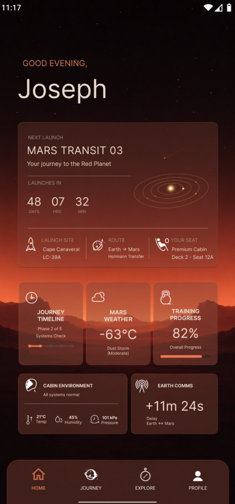

Recently I took part in a design competition centred around creating a fictional mobile experience. The brief was deliberately open-ended, the only stipulation was this: design a home page for a fictional application aimed at customers of a mars/space transit company.
Rather than approaching it as a traditional sci-fi interface, I wanted to imagine what a real consumer product might look like in a future where interplanetary travel had become a normal luxury experience.
Starting With the Environment
Before I thought about cards, navigation or information architecture, I focused on the background.
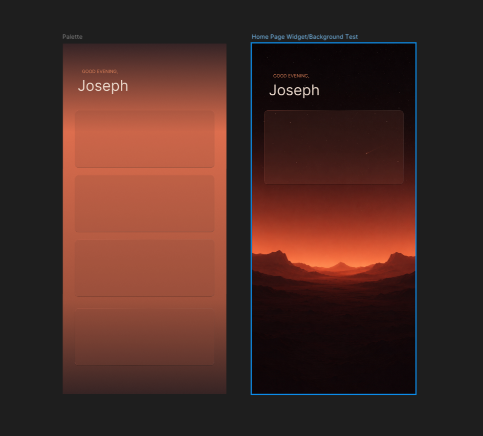
I had a very specific image in mind. A minimalist Martian landscape sitting on the horizon, gradually fading into a star-filled sky above. I wanted the environment to establish the setting without overwhelming the interface.
A lot of space-themed concepts rely on detailed illustrations, planets, spacecraft and dramatic effects. While those visuals can look impressive, they often compete with the content itself. I wanted the scenery to feel atmospheric rather than decorative.
After a number of iterations, I settled on a layered landscape positioned around the middle of the screen. This gave the design a strong visual anchor while preserving a large amount of negative space in the upper section.
That empty space became one of the most important elements of the final design. It helped create a sense of scale and calm while giving the interface room to breathe.
Creating Interface Elements That Belonged in the Scene
With the background established, the next challenge was making sure the interface felt integrated rather than simply placed on top.
My first attempts used more traditional solid cards, but they felt too heavy. They disconnected the user from the environment and immediately made the design feel more like a dashboard.
To solve this, I moved towards translucent glass-inspired panels that allowed the background to remain visible beneath the interface.
The goal wasn’t to create an exaggerated glassmorphism effect. I wanted something subtle that would preserve the atmosphere while still providing enough contrast for information to remain readable.
Finding the Right Balance
This ended up taking more experimentation than I expected.
When the cards became too transparent, text and icons started losing clarity. When I increased opacity, the interface became visually heavier and lost some of the connection to the landscape beneath.
Eventually I found a middle ground where the panels felt light and integrated while still supporting the content they contained.
A lot of the design process consisted of making small adjustments and then immediately pulling them back. Tiny changes to opacity, blur values and shadow strength had a surprisingly large impact on the overall feel of the screen.
Subtle Details That Added Depth
One area I spent quite a bit of time refining was the card borders.
A standard solid stroke felt flat and artificial against the soft background. To introduce a little more depth, I used subtle gradient strokes that catch light differently around the edges of each panel.
It’s one of those details that most users would never consciously notice, but it contributes significantly to the overall impression of quality.
The challenge was keeping the effect understated. Whenever the highlights became too visible, the cards immediately started feeling artificial. The best results came from making the effect barely noticeable.
Combined with the transparency and blur, those small lighting variations helped create the impression that the cards were floating above the landscape rather than sitting directly on top of it.
Building a Mars-Inspired Colour Palette
The colour palette was heavily influenced by the environment itself.
Rather than leaning into bright reds, I chose a collection of muted oranges, dusty browns and warm off-whites. The intention was to evoke Mars without constantly drawing attention to it.
I wanted the colours to support the setting rather than define it.
The warmer palette also helped reinforce the premium travel direction I was aiming for. It felt more inviting and sophisticated than the colder blue tones often associated with futuristic interfaces.
Designing for Passengers, Not Astronauts
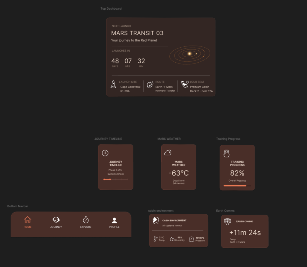
One of the most important decisions was determining what information would actually appear on the screen.
Instead of fictional spacecraft controls or technical system data, I focused on information a passenger would realistically care about.
The interface includes launch timing, training progress, cabin conditions, communication delays and environmental information. Even though the product itself is fictional, I wanted the information architecture to feel believable.
The objective was to create something that felt closer to a luxury travel app than a mission control dashboard.
Final Thoughts
Looking back, the aspect I’m happiest with is the overall atmosphere.
The combination of the minimalist landscape, warm colour palette and translucent interface elements created exactly the feeling I was hoping for at the start of the project. Calm, aspirational and quietly futuristic.
If commercial travel to Mars ever becomes commonplace, I suspect the digital experiences surrounding it will feel much closer to consumer travel products than the dramatic science fiction interfaces we’re used to seeing.
This concept was an opportunity to explore what that future might look like.
See the final outcome below: